Introduction
For my Final Major Project I am planning to create a short video showcasing the evolution of tactical role playing games throughout history. For my project to succeed I plan to create a simple bedroom environment in Maya and Unity, and make the viewer be engrossed in it from a first person perspective. I will then model each device that the viewer will play on such as the board game/gameboy/latop ect. Separately in my own time I have planned to draw and animate with the use of Krita, Photoshop, Flash and Gif Maker the scenario of the game that will continue throughout each device, taking inspiration from the artists whom originally created them for the art and gameplay styles.
FMP Statement Of Intent
 |  |  |
|---|---|---|
 |
FMP Timetable
 |  |  |
|---|
Initial Ideas
Idea 1: Freak Circus
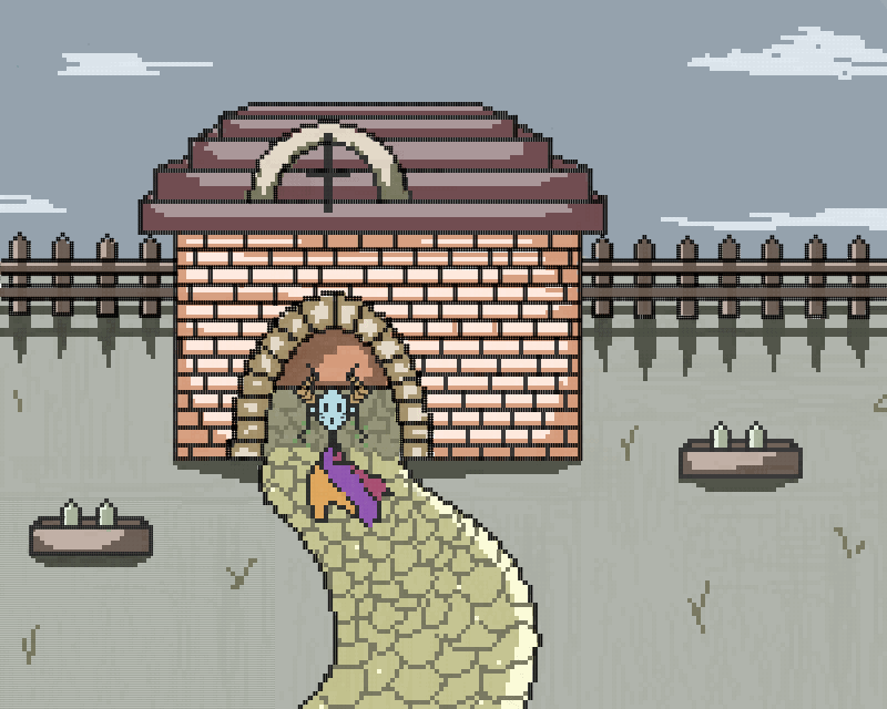
My initial idea was to create a dark environment of woods in Unity which I would use for atmosphere and then modelling the circus and cars that the 'entertainers' would be kept inside of in Maya. Textures would have been done in Unity also. I believe this idea came from my fascination with the song 'Dark woods circus' by Vocaloids which is linked below. It shows the torment of people of circus back in the 1800s when anything unusual about a person could make them a side show for the rich and poor. This is of course based on real life events from the said era. Although it is a very depressing topic it often makes for one of the best horror aspect to cover since it deals with real life issues; exaggerated or not. This is similar to how people often make horror media based on asylums.
My idea was to take this concept of horror based on the real events that took place in such circuses and make a walk-through environment based on the song 'dark woods circus' by vocaloid. I would have modelled dark wood environment and input the actual circus ad cages where the characters would have been kept in at the time. My Mudbox skills aren't the greatest so I would have drawn the characters and to add a strange charm to the while concept would put the drawings as models inside the cages. I would then have the song play in the background for atmospheric purposes and for those who would understand the reference. Clearly my target audience would be young and older adults since the short film would be 18+. Another idea I had was to instead of making the environment in Unity I could film myself in dark woods walking around and then input the models in there for them to look realistic.


Idea 2: Evolution of RPG
My second idea was to create a short 1-3 minute video presenting to the audience the evolution of RPG games. It is probably the most personal FMP I could have chosen to create because I have spent my entire life playing RPG games and watched them evolve in 19 years alone so much that I wished to delve deeper and start originally in the 80s with how board games truly kicked off the appeal for rpg games and the genre. This would later develop into pixel games, the main console of the 90s being the early GameBoy, which proved to be one of the most well selling consoles of its time despite having very pixelated limited graphics. Early 00s were the era of early consoles and pc gaming however they mostly sold games due to advancing graphics and game mechanics, a great example of this is any game from those times with 3D animation and rigs. Lastly we now live in an era where people adore indie games, created by individuals not relying on huge companies and studios to support them, they usually show off a unique style.
If I chose this idea my unit would allow me to use all programs that I have learned to use throughout this year since Unity, Maya and animation/drawing programs such as Krita would be of purpose. I would create a short animated/modelled clip from the perspective of someone who is playing all these games in order, it would resemble a well put documentary or an informative yet fun video for someone to watch for the visuals or out of interest. The story line would follow a typical rpg story line, that'd evolve with time, along with the art styles and animations of the scenes.I wish to make it very easily understandable what the point of the video is, and for it to come across for my audience as something more than documentary; also as entertainment. I believe the biggest issue with this idea would be story boarding and organizing my plan well enough to finish it in time and achieve all my goals with it.


Idea 3: Horror Game
My third idea was to create a horror game based on games such as: white day, clock tower, hello neighbour or remothered (three of each are shown below). All of these games are stress inducing and rely on the games ai heavily, with the smallest of sounds leading the killer to the players location. They typically include having the main character we play as be chased by someone around a closed off environment that they are trapped in such as a house or school building. The player is forced to work their way around an unfamiliar environment and avoid making much noise but also listen out for the killer in case they are close. They rely heavily on coding of the ai and their atmosphere, most (remothered) unfortunately failing in their story unfortunately. However their unscripted events that rely on AI always appeal.
My idea was to create a game where the player is in a closed off environment such as a school and having a soul or some sort of supernatural spirit be after. I would have to model the school (At least one floor with rooms and hiding places) and code all character actions, hiding actions and the souls AI so that it acted similarly to all the other games I have researched and taken inspiration in. I would also have to borrow rigs of characters or create my own in order to use them as the one character we play as, as gamers, and one which chases us. The more probably option is that I would have to search for a useable rig similar to that of Franklin but it would require a fearful look to fit my games atmosphere. The environment would heavily rely on its lighting and dark tones like all Guillermo del Tot's paintings and films. Unfortunately this idea was earliest to scrap because both my coding and texturing aren't on par with these games and even a simple demo would be beyond my ability.


Final
In the end I have decided to recreate my second idea in my final major project. It is an idea that I feel is most unique and has most potential. It is as well a concept that I feel is closest to what I could wish to accomplish and a topic I feel most confident in since I've been in touch with it my entire life and will haven problem presenting it as my unit. It may not be an accomplishment that will get me the highest grade nor one I will be able to finish in the strict time period however certainly it is one which will make me feel most accomplished and I know I will be able to put my all into without getting at some point confused about its aim. I also know that I possess all the researching program skills required to make this final meet its ends.
As said above, I will need a lot of research on the art styles and gaming mechanics of the RPG genre games at the time of their releases and their specific eras. I then will delve deeper into cornering off my idea and making it more specific, for example researching a more specific genre than just RPG games; I will also plan to look into its most popular sub-genres. I will be able to use most or even all of the programs that we have used this year to develop my project and finish it off which will show my understanding and ability to use them.
Research: Genres
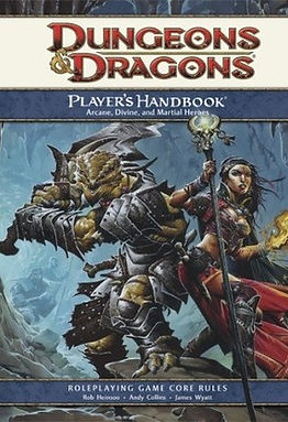
I have decided to look up the most popular genres for board games that continued into video games. Since the most popular board games to date are fantasy/tactical games such as Dungeons and Dragons I wished to look more into those genres and see what made them live throughout the years. Another popular genre I've observed among these games was adventure, where no player stays in the same place for an excess amount of time. Through these games the players are supposed to play through their ideal fantasy or lives, where anything and everything is possible depending on the creators limitations and the rulebook.
RPG
The first genre I have decided to search into was role-playing games. these games engross the player into their story by putting them in the main character's shoes. Some letting them choose out of multiple characters to others allowing u, the players, to customize the character from cheat to toe, from their looks to personalities. These games include character interaction whether between the multiple players themselves of occasional NPCs that the heroes/villains will encounter. I wish to include this game genre in my video due to its sheer popularity among audience and how vast the possibilities with it are since it creates a limitless world along with itself and its characters. Examples of RPG games I've seen and played throughout years are Dark Souls, Dragon Age as well as Secret Of Mana. All of these games give the player a huge open world experience with fantastic battle systems and scenery even if they date back to '98.


Tactical
The second game genre I have decided to research was Tactical. Usually this is a subgenre for Rpg/Fighting games. My personal favourite battle style in these games is turn based, where you get to move your units around and decide for all their instances then it moves onto your opponent where they have the same opportunity given to them. As I was researching Tactical games I stumbled upon three titles I was well acquainted with; Fire Emblem, Valkyria Chronicles and Final Fantasy, two out of three of them having the turn based system. Unlike puzzle games this genre concentrates more on the battle itself rather than individual way of problem solving; you can easily pass their levels in many ways, each gamers experience will be therefor unique which is an aspect I enjoy and would love to implement the idea of into my video.Hopefully I will be able to recreate the retro battle screen these games are known for and animate at least one simple battle animation to show this genre off.


Adventure
Adeventure games are known for players taking on the role of their protagonist and solving multiple puzzles throughout the adventure. Most of these games have a semi to fully open world that the players can explore and get easter eggs from. It focused not only on it's puzzle elements but also it's story elements through narrative or subtle hints about the world and its lore. Most are designed for single player and similarly to RPG games often allow you to either customize or choose your character based on their looks or abilities; this is up to the players taste. Most popular and known to me examples of these games are The Legend Of Zelda, Tomb Rider and Fahrenheit. In my project I wish to include the character selection screen as well as an example of the puzzle solving element from this genre, the only thing I believe I will have to miss out on due to time constriction will be an open world aspect.


Research: Tactical RPG Games
Below is my research on games which fit my genre criteria. They range throughout years, each marking an era of games and at what point such game was popular. I naturally started off with board games and then moved onto games which took place on devices just like I said I would with my video on my FML sheet. Researching the history of these games and seeing how much they have evolved throughout years was very intriguing and gave me a good insight on what to implement into my mini game.
Although the first tactical role playing games go hundreds of years back, with games like chess counting into the wide spectrum; I have decided to instead cater to my audience and went with games which most people know from their childhood and officially count as role playing tactical adventure games. Board games such as the Talisman, Warhammer 40k and Dungeons and Dragons have been around since the 70s and truly started off many people's passion for rpg games, also inspiring future video game titles and their stories with their forever expanding universes and lore. I wish to recreate the board and story focus from these games and look into how much games throughout time were inspired by them; continuing the story line from game console to the next as the scenery 'evolves'. My story and characters will in most likely case be entirely inspired by these games and their unique for the time ideas and innovations. Art wise I hope to recreate the board and dice in a 3D environment using Maya as my main program.


Board Games '74-'87
Pixelated Games '87-'92
Soon after the peak in popularity of rpg games caused by the controversial yet fantastic board games like Dungeons and Dragons; video games followed suit and began to recreate the genre in their own special pixel world. At the time games like Fire Emblem, Final Fantasy and the Shining Force hit the markets and scored all the right marks and potential to gain huge popularity. They had a very story driven yet combat oriented game play where nearly everyone could find something to enjoy. Although the animations were limited at the time to only small screens or pcs which were only able to create low resolution games, the producers still managed to get out fantastic games which awed their audience with their pixelated yet detailed scenery and character interactions. As seen on the gif below is a battle scene from Fire Emblem in usual combat screen that came up when two enemy units interacted after players chose their item/fight option. I hope to recreate a similar small scenario as well as dialogue during my recreation of Pixel Games.


2D/3D Games '95-'03


After the huge hit of video games the technology started to evolve and transition into putting more effort into its art. The world of games at this point became much more open and instead of following direct story line we were able to explore the world to our hearts content! Stumbling upon resources/enemies/equipment as we went along and explored instead of only getting it from fallen enemies we were programmed to encounter. Games such as Vantage Master, Heroes of Might and Magic and Disgaea came about and awed their audience by not only their open world but also 3D/2D switching as we were able to see our characters from many more angles than previously and rarely were able to only see one sided camera view of the battlefield. I certainly wish to implement a bit of the 3D/2D switching in my final project and show how the animation of characters and art evolved alongside the game mechanics! It'd be especially fun to explore all sided pixel character animation of the walking cycle.
Indie Games '14-'16


The final step that I have researched is more company wise than story or animation. Indie games came about not long ago and became very popular; allowing anyone to make their own game and make a living off of it, giving many upcoming creators, without huge company's support, follow their dreams and creating a game with fan support funding. These new role playing tactical games take art and story aspects from board games in most cases and game mechanics from the newer games; creating fantastic eye-candy mixes of the two! They originally inspired me to create this project purely because of how the creators enjoy putting so many old and new aspects together to create their new original games. These games are usually sold onto Pcs or Laptops, taking up very little space despite their vast environments and detailed animation. I hope to have them as my inspiration for the finale of my video, where I put all the past games into one concluding ending with story, art and game play inspired by all past games we have seen during the video.
Research: Art/Concept Art
Talisman '85


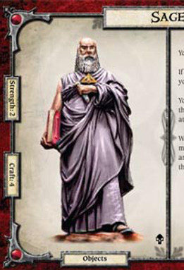

For the fist part of my animation I will have the viewer overlooking a game board, then picking up each of the four character profile cards, looking into them to find out information about each individual character. They will then pick up the 'quest' and read over it. Each of these props and their art will be created by me and their art style will be based on the Talisman board game from 1985. As seen below I have looked up the original Talisman game, or rather it's first edition, and the art that is shown on the board game/character profiles/manual and enemy cards (Although in my research I mainly looked into designing the main heroes profiles since other parts of the game will continue on electronica devices). As you can see the art style heavily relies on realism in the new edition (Seen on the right) however the older version which I will be replicating has a much more comic book vibe coming from it with harsh black outlines and shadows. I will create 4 of these cards, each for a different character type, all races inspired by the games'.
Fire Emblem '90-Now
Although I have never experienced creating a pixelated environment I knew I will have to do it for this project. For this scene the character moves away from the board game and instead switches on his gameboy advance where the first part of character dialogue takes place. The main point will be to create speech icons of the four which occasionally switch expressions and open their mouths to speak. For this part I took inspiration from my favourite game franchise Fire Emblem, or rather it's fist game, Fire Emblem The Shadow Dragon, The Blade of Light from '90. I searched up not only how they designed their characters but also how different they appeared as icons, as seen on the right and below. I will also be creating a simple looking dialogue box as seen below and inputting text into it. t the beggining I was very tempted to create the character cards in this style as well however it wouldn't be right to do so considering the theme of the project is evolution of games therefor I can not skip steps and have to show all different art styles .


Disgaea '03-Now
For the third part of my unit I wish to look into games ranging between '95 and '05, where the popularity in advanced animation skyrocketed and many game studios began to use two different style for these games; the 3D and 2D combination. The 2D is usually used for cut scenes where a single image is displayed to portray a scene or for dialogue boxes when the characters speak/ At the time the 3D animation was still vastly limited. I plan to create a very simple hall similar to that in the screenshots I have gathered for me research and create very simple models of at least two of the characters. The dialogue will then continue from where it left off on the last device, this time it'll be on a PC and I will be able to show off the mix of 2D and 3D that I am mostly inspired by for this part of the project. I will also create a simple yet more complicated than the last dialogue box similar in style to the on seen on the second screenshot and allow the scene to play out.


Tahira '16
The final game I researched for art style inspirations throughout my game was Tahira, produced in '16. It is the newest game on the list and will give an insight into indie games that boomed the market of steam and ichigo in recent years with their unique art styles and story that try to implement old techniques and don't cater to audience as much as popular gaming studios which only wish to create more realistic appearing games. The indie market sees the potential in using 2D art as well as re using old techniques in games which went 'out of fashion'. Just like my project these games provoke nostalgia in most cases. I wish to draw out the environment using digital art and changing it into battle ground where a simple battle animation will play out using 2D models of characters. It will take maximum two actions for me to animate the whole scene before the video I am creating ends. I hope that in this part of the unit the story will be apparent to the audience as well as what it is that I am trying to convey.


Research: Character Designs
The first studio I looked at when designing my characters was studio ghibli. It has been created back in 1985 by its four founders, Isao Takahata,Yasuyoshi Tokuma, Toshio Suzuki and Hayao Miyazaki. During my childhood and even up until now this studio was my main source of inspiration when it came to art style and character ideals/ideas. They specialize in recreation of mythological creatures which are mainly portrayed in negative light and featuring them as child friendly and appropriate for all audience. I believe what mainly is spectacular about their work is their water colour character sheets. You can already tell their personality and demeanor in them. I wish for my characters to have taken some inspiration taken from characters by studio Ghibli such as 'No Face' who's original design as seen below composes of many fantastic and original elements that all create a celestial appearance. Their design sheets aren't about showing off the characters appearance only but also their personality and qualities.


The second franchise I looked at for character design inspiration was Legend of Zelda, mainly its newer games like Breath of the Wild or Twilight Princess. I have always been fascinated by the verity of creatures found in Legend Of Zelda because of their simple and colourful designs that were very memorable. I mainly took inspiration from the breath of the wild designs as seen on the right and below this text; they were very colourful designs of the horse goddess and the korok species. They weren't humanoid however bared enough resemblance to be classified as humanoid creatures and have their designs not scare off children when the game was produced. I wish to have my characters resemble these under the aspects of being colourful and appropriate for all age groups yet still be very original and not fall under a typical creature category where they could be mistaken for something outside the franchise. The two other images show character design sheets used for twilight princess which help develop character.

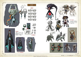
My final area of research for character art was a game created around 2010 called Ni No Kuni (Also known as The Wrath of the White Witch in its English title). Its art and subjects are heavily based on my other area of research; Studio Ghibli. It is an RPG game similar to Pokemon, with its variety of trainable creatures and open world aspect however a much richer story line. I love the 'familiars' art, as seen below the creatures available to this world are all very different and easy distinguished. What I wish to take inspiration from mainly in this franchise is how simple designs can sometimes be more effective since they're easily memorable still due to their small unique features instead of having an over designed character which is later not only difficult to draw each time around in the game but also has hard details that barely any audience will notice; this shouldn't be confused with design easter eggs which make the design more unique and memorable due to them, although those are far in between.


Studio Ghibli


Legend Of Zelda


Ni No Kuni

Story Creation
The document on the left contains all of my detailed planning that I wasn't able to include in my FMP proposal. Each segment is dedicated to a different topic and all is described in simple yet accurate manner. The first segment focused on the characters that I will be including in my work, their briefs describe what will be written on their character profiles with the board game segment as well as their stats will come up with every segment from then on. I took inspiration for the layout from Talisman as well as the stats I used. I tried my best to make each character unique enough on paper so that the players would have many options to choose from if they were actually playing the game. The next segment 'narrating story/quest info' covers a simple quest card that the character will pick up in his room and will let the viewers know that despite the main quest there are also other side-quests that they can take on, this does not mean the quest will be included in the video but rather will be a neat small detail that I hope the viewers will appreciate. The final and most important segment is 'dialogue/scene'. This part covers all the interactions and scenes that I will have to create and sketch the story boards for as well as covers the entire dialogue that I will have to input into the dialogue boxes.
Storyboard
After outlining the cards and story for my board game I have decided to work on the story board. It was quite easy to find a template for the story board for me to sketch over in a drawing program; the one I chose was Krita. The link to the template website is below however I found the original through google search:
https://networkedmedia.wordpress.com/2013/05/08/storyboard-templates
As seen on the right I have sketched out with very simple art the story outline so that I could see if anything had to be changed I'd be able to do so right away. It also allows me by eye to estimate how long each scene will take to create and how long the overall video will be. By looking at this draft alone I would say it'll last about 2 minutes and a half or slightly longer. This sort of story board also allows me to see what I need modelled and what wouldn't be in the view and can be put off as detail that can be done in the last couple weeks of my project if time schedule allows for it. It also allows me to see, although simplistically, what each scene will require sound wise and sound effect wise. It will be simple finding youtube clips with the effects I need or I could replicate them myself since they're quite basic however nonetheless I will keep it for last since it's a part of the project that can be done in a day or less. I didn't input all the dialogue the characters will have into the story board since it's all outlined in the word document above in 'Story Creation' section of my Wix.
 |
|---|
 |
 |
 |
 |
 |
Character Creation+Character Sheet
 |
|---|
 |
 |
 |
 |
When drawing I began off by creating the character sheet which I would later fill in as a character profile. You can see the progress of the character sheet below, how it started off as a traditional sketch on paper, then was later scanned and slowly drawn over in a drawing program called Krita. I have used simple pen tool for the outlines then many different paint and marker for the outside silver frames to give them a realistic shiny glow. The inside was painted using sponge tool that gave uneven darker tones as if the red had been spilled on the page and the right side resembling an old page was yellowed with time. Then on the right you can see the final product which I will use to show off my characters on. I took inspiration from the Talisman character sheets since I wanted to give it the 80s and 90s original character sheet look when working on my first part of animation; the board game.


After designing the character sheets I went on to sketch out all character classes based on he document I created with their backstories and also the character design research I did. I drew all of them in a rather simple cartoon like style so that it was easy to develop their designs later if I wished to change anything during my painting process in Krita. I wished for all the characters to be unique in appearance and stand out despite their simple designs. I wished to carry out a different theme with each one of them also, having them look their part however hard that was to achieve since I didn't want them to look too obvious nor have their designs be copies of already existing characters. And so, below you can see the following in order; medic, bard, wizard and warrior, each of which designs I will explain below.
 |
|---|
 |
 |
 |
 |
While working on my main character; I began off by creating a simple yet understandable light sketch on Krita, using the pen tool and changing its opacity down to about 25% so that it would be easy to pain over it while still seeing its outlines. You can see me do this on the first screenshot on the slide show. I took notice of all the details I put into the original traditional sketch I did on pen and paper and was able to instead re-create it in a different, more original yet old fashioned style, which looks much less appealing to younger audience and much more to young adults who are not only my main audience but also the main audience for Dungeon and Dragons styled board games which's style I am trying to replicate with this.
As seen on the second screenshot I began doing the fabric 'tails' and head of the character. The head was possibly one of the most challenging parts of me which required constant re-do's. Creating a basic oval shape and using the shade tool to shade in the dents and lighting as if I were colouring a mask was very difficult since the shading would often go outside the outlines of the oval and I would have to constantly erase it. I had to use multiple shades and tones of blue, green and purple to get anywhere near a realistic tone for it. I then began to colour in the basic fabric which acts as the character's 'tails' which give it a more fantasy feeling. It was pretty simple as seen on the screenshot since I only decided to use three simple tones that would work well with the mask.
On the following screenshot we are able to observe the finished product of how the fabric tails look, I created this rather simple but effective look by using the marker tool in Krita. I used many colours which are close on the colour wheel and their different shades to get my final outcome for each of the fabric tones. I quite enjoyed working with the 'flow' of the fabric which gives the image more life in my opinion as well as the horns which I later added on. Admittedly taking a lot of inspiration for this character from the legend of zelda character found in horse fountain.
The last two following screenshots show me playing more with the mask/face tones and lightening it up a bit and add reflection using simple shading tool and using a much brighter blue. I also added horns and ears using the same method I used to create the mask which proved to be much more simple with these two elements of the design. The hair which comes out of the horns was the most difficult and challenging part for me to draw since I had to draw the outlines and then work within them with paint brush tool which required a lot of work; it needs many strokes to create realistic strands of hair and shadow work for them. Even after making the hair I wasn't happy with it and selected the layer it was on, using the special effect up on the edit layer bar to change not only the opacity of the hair but also it's tones, changing its previous blonde warm tones to cool purple/blue which I feel fit in more with the overall design, this was simply done by turning up the blue tone up and others down.
The final touch ups were deciding what should stay in the design and what would take too long to create/would cluster the character profile. The small earrings with leaves I added because they added to the character's personality and the flow of the picture, however I decided against adding the arms as shown on the sketch since they would obstruct too much of the character and make the image loose its mystical appearance. The leaves were simple to do with the same method I used for the mask, I made one and then duplicates it; simply changing it's axis and size.

 |
|---|
 |
 |
 |
 |
Similarly to the main character I began off drawing the Bard off as a simple sketch which was based on the full body, yet childish sketch of him that I at first did on paper. I wanted the images of these characters to be more than just standing up poses, similar to T poses, since the original sketches already resembled that. Instead I worked on developing personality and traits into the digital artwork of them as seen above by giving them a pose and giving the bard a flute to accentuate his role. I used the pen tool and the blue tone to create the sketch after which I turned the opacity of the layer to 25% so I would be able to draw over it later similarly to how I did with the medic.
As the second screenshot presents I began painting the drawing of my character by starting off with his head, drawing and colouring in with the base colour its outer shape before working on the details of his facial expression and shading. Again I used a basic shading tool and pen tools to achieve this as well as different tones of red, brown and purple to gain a realistic colour contrast and shading work. I then began to work on the rest of his body which wasn't as challenging as the face because it didn't consist of all the facial details.

Above are shown the final products of the character sheets I have designed for the board games aspect of my video. i am very happy with the end results of this since they look very professional and as if taken out of a real board game manual. They also make for really neat references for the main characters of my project. I was unfortunately not able to produce more character sheets than this due to time restrictions but I feel like if I included the other characters also and they didn't appear throughout the rest of the story like I planned then the audience would get slightly confused. So it might have solved those misunderstandings. I used Krita to create both the sheets as well as the character drawings and then an online text generator to create the text, which all of I planned carefully out in my FMP Story Creation which is linked above.
Dialogue Boxes
Using Krita as my main program, I created three different dialogue boxes, each corresponding to different segment of my video. I took inspiration from my art research and the dialogues I have notices in the screenshots I took where dialogue boxes are visible. I have essentially encountered no problems when creating these boxes and all I think fit into the era they're trying to portray.

The first and simples box to design was for the first segment of my video. It focuses on old pixel games and so the dialogue box is not only small to sit the old small screens that Gameboys had but also I only used the pixel tool to create it. When I input text inside it; it will be white and also pixelates, most likely all letters will be capital to make the text readable and make it stand out on the black background. I didn't put too much detail similarly to the box I was inspired by.
Above is the second box I have designed based on the 2D/3D era of gaming. I based it off the dialogue boxes I saw during my art research and created it in Krita. It took slightly longer then the first box and was slightly more complex since I had to add brown shade and put a texture over the inside of the box to make it look almost like a pin-board. The text that I will later input will be black with a normal font similar to those seen in research part of my work. I believe it will stand out nicely on the soft yet light background.

The third and final was the hardest dialogue box to design because of the sheer amount of shading and layers I had to use to design it. Since Indie games take inspiration from ancestors to create original and unique designs I decided to take inspiration and colours from usual character cards that board games provide, giving the background a worn out paper look and making the outside seem almost like a cave ceiling. I modernised it slightly with the outlines that have a metallic look and screws keeping them together. I had to adjust burn colour with the red since at first it was too soft and didn't stand out enough. For text I hope to use old fashioned font to represent even more the board game/fantasy feeling.
Bedroom Progress


As seen above I started my project of designing the room my making a simple sketch of it in the above perspective. I wanted to fit the entire scene in the room however as I began modelling I have realized that the final renders would not be as good as I would have wanted them to be if I did it that way and would take way too much time since the desk and walls alone were taking up to an hour to render out with the textures on. This is why I began to slim down my project idea and decided to have the scene take from only one room angle and it be pointing at the desk which would hold all the devices. As seen on the slides; I began by creating a simple room with a desk and a lamp, I imported the PC so that I could make everything up to scale with the already done devices, simultaneously making sure the quality of both was on par so that one wouldn't stand out as the worse from the other.
I began texturing as soon as I done my desk, giving the object a dark wood texture which didn't work well with the wood on the floor at all, nor the white wall paper. Considering I didn't like it, I decided to change the wall texture to yellow to give the room a nice warm hint as well as swapped the desk texture to the one the wall previously had which worked out quite well in my opinion as seen on the third render. At the same time I have added a couple of squared and gave them a book/magazine texture and sat the in the gap at the top of the desk and gave a mouse pad a texture of a character from legend of zelda which was a small Easter egg and a nod to the fact I was inspired by both the character and the game.
I felt like the scene was a bit too empty and thus decided to ass small details that would fill it out such as a couple vases at the top (Which I gave the Blinn texture so they would reflect the light nicely and shine, showing off multiple textures in the scene), but also adding in the GameBoy I designed earlier, created a couple boxes to have underneath and also added four sheets of paper and a lamp to make it look like the room was actually in use by someone for some time instead of having it all neatly organized. I didn't exactly enjoy the model of the lamp I made notr how the textures smeemed to not work with it and because of that I later got rid of it from the scene.

Seen above is my final render of the scene. In the end I got rid of the lamp and instead added the laptop I designed in Maya to fill the scene in more and added some posters which, again, were great references to the games I took inspiration from to make my project. Considering I didn't like the other renders I took because they were too bright; I added a sky light AI and changed the colour to dark orange which in my opinion gave the final render a beautiful orange hue and made it look to be an evening scenery.
Devices Progress
Gameboy


Following the above tutorial I have started by modelling my Gameboy first since I knew it will be the most challenging out of all my models due to all its small parts and simply their quantity. I started off by making a simply cube and using the smooth tool in maya, adding many divisions in the cube until I got the desired shape of the game boy. I multiplied it twice and put the thinnest cube in between the other two to give the gameboy volume. I then shaped the buttons using same techniques as I used while making the shape.
Using the booleans tool I then shaped out the screen and stuck in a smaller smoothed cube to create the look of a coming out screen. Using booleans I then shaped out the small 'hood' at the top of the model to give it a more realistic look.

As seen with above screenshots I present how the booleans tool works by creating the classing stripes the gameboy has on the back part. Since the stripes couldn't be made with only one or two sides; because the smooth tool doesn't work unless the whole area is rounded; I surrounded the main shape as seen on first screenshot and then used booleans to get the result you see on the middle screenshot. Also while using the tool and playing around with individual pressure points I have managed to create a dent under two of the buttons to resemble the one in the original gameboy. I've had a couple difficulties with this model since the booleans tool didn't work quite as well on a smoothed object as well as I couldn't smooth it in mud box since the model would go back each time to how it was when imported back to maya.

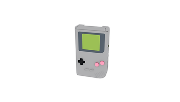

After finishing the untextured model as shown below and rendering it out in arnold, I was able to start working on a textured version of the objects as shown on above screenshots where at first I tried by finding each separate colour on the colour wheel when I was searching up for textures based on the original model, the colours however turned out far too off the original and when rendered with lambert, were too bright or dull, the buttons I decided to make using blinn however that made them look too bright in comparison to the rest of the gameboy. Then as seen on the second screenshot decided to use textures off the internet which turned out to look much nicer and professional in the end however the screen was of a wrong colour when compared to the original screen so on the far right you can see what texture I found on the internet to use for the screen as well as the colour of the final gameboy plastic cover.

On the left is the final product showing a untextured model of the GameBoy, whereas on the right you can see the final render of my GameBoy model with the final textures I decided to put on it. I am quite proud of the final results although the renders took quite a long time to produce due to the great amount of polygons in the model which were caused by my multiple use of the booleans tool on the model, I hope not to repeat this mistake with my other models in the future and hope this won't affect the future of my work when the scenes play out in a full room where there will be a lot more things for the computer to render out. In general I believe this is the closest I was able to get to realistic console with the technology available to me at current time and think the textures I chose are convincing and will look great in a fully done environment.
My last couple renders had to be saved as screenshots rather than saved pictures of the renders since the program, maya, would change their colour to much darker; thus I had to deal with leaving the white background behind them instead of having a nice png file with no background like I did with my textureless models.


PC

One I finished the gameboy I went ahead to create the computer from scratch, I used multiple tutorials online to help me as well as some examples I found online on google of computers so that I would have a better understanding of what the model should look like. Mostly I used the extrude tool to change up the shape and create the monitor, I had to create a separate part to create the stand, again simply using the extrude tool to create it and adjust it to fit the back of the monitor. After I created the final effect (See render one above), I moved onto creating the computer itself which I figured should be a simpler task since it was a square with a couple details, however following the tutorials proved to be much more tricky as when I tried to do the insides it was rather hard to see how far they went into the PC and I had to make many divisions for each section to be made.


Since it was so hard to see when the extrusion tool wasn't working properly I have looked up how to deal with this problem and found a fantastic solution where I was able to change the opacity setting and as seen above make the outlines only be shown of the computer, it also allowed me to choose the colour and purple was quite easy to navigate with since it contrasted the grey background. This allowed me to easily make changed to the design and see how it looked like inside and outside the model. After a couple extrusions I can show the final product rendered on the right of the pc itself along with its monitor on the left.


I then began to model the keyboard, which was relatively easy since I just took inspiration from the one I was using at home. The keys were the hardest challenge to create because of the distance between each as well as their size in comparison to one another, however the finished product is shown above as I rendered it out along with a crude square shape that later turned into the mouse for the computer. As seen above I used the Insert Edge Loop tool as well as Crease tools to smooth out and/or add areas to the mouse so that I wouldn't be forced to use the booleans tool like I did with the Gameboy thus avoiding long rendering time and an enormous amount of polygons.

 |
|---|
 |
 |
 |
 |
On above screenshots you can see me using the extrusion tool as well as again changing the opacity to all the objects in the scene to make it easier to create them without worrying about the damage I might be doing to the model inside. I came up with a rather simple but good model for the mouse my looking at examples from the internet, I however, didn't want to make it too simplistic and went off a more rougher example found on google, since it'd be more likely to represent a gaming mouse. After creating the mouse I went ahead to start texturing my models as seen on the slideshow above.
I began off by finding suitable textures of black metal and silver in order for the textures to work with my model, I also found a perfect screen texture that couldn't work for my Gameboy since it was black and not green however turned out to work perfectly for my monitor as you ca see in screenshot one. Finding a keyboard texture was much more challenging as an experience however once I found one it wasn't too bad changing the position of some keys to fit with the textured numbers and letters. I didn't want for the model's textures to be completely monochrome since I foud it quite boring and as if it would blend too much into the rest of the scene to make an impact or even be taken into consideration by theviewer; that's why for the mouse, buttons and inside of the small spaces in the PCs separations I added a green hint that comes out when rendered to be neon and in my opinion brings out the small parts like that, that would usually be dismissed.


On the left and right above, you can see the final two forms of the PC, one without and one with textures. I am quite happy with how the model turned out as a whole however if I got the chance to create it again I would have definitely preferred to make a more smoothed out mouse that would go more with the rest of the design for the PC and its additions. I would also have liked the keys on the keyboard to go with the texture, if I were do create it again I would have put the texture on first and then the keys so that I would be able to see how they all fit underneath. I am pleased with how the rest of the textures turned out, especially the neon green that makes he small parts of the PC stand out and look like the system is on and they're lit up.


Starting off to create the laptop was relatively easy, at first I created two duplicated of a rectangle that I then smoothed the edges out to, using the extrude tool to dent inwards a screen like shown on the first screenshot above. and making many edge loops so that the smooth option would work fine at the edged like its supposed to. I used the same technique at the bottom to create two dents; one for the keyboard and one for the touch sensor associated with all laptops. I admit I only used very small and simple laptops as examples to create this model. I then added into the dents two buttons, right and left click and again copied the keyboard I used for the PC so that it would look relatively simple and similar.


I then began texturing the laptop which proved to be a quite simple task, considering it didn't have many parts to it. I input firstly a basic screen texture that also worked well on the PC for the monitor, then also copied the PCs keyboard texture since it fit last time alright with the key positions. Figuring out the right material to put on top of the laptop however was quite challenging since all silver or metallic textures turned out looking too shiny and fake as seen on the second screenshot. In the end I settled with a non reflective silver texture that I found by searching up metallic grey textures on google. As seen on last screenshot I think it works quite well as a whole with the design, leaving me to only correct a couple textures such as the touch screen and side bits that represent the rubber.


Above are showcased my final two renders of the laptop, one with and one without the textures put on. I am quite pleased with the results I have achieved although again, if I were to repeat making it I would have chosen a much better way to create the keyboard since similarly to the PC it has the problem of the texture to fitting perfectly on each key which can become a problem later down the line when I render it out in an environment close up. Overall though I believe the textures and contrasts between them turned out quite well, especially between the outside of the laptop and the buttons/touch pad.
Board Game Progress
 |
|---|
 |
 |
For the board game I have decided to make it in it's own little scene, surrounded by scenery that is a bit futuristic and relates to the topic of evolving games. at the very begging I created a simple board and gave it a texture of a board game I found online that I thought was very fitting with the idea of RPG board games from the 80s and 90s since it had many different types of environment. I then went ahead and created the dice which showed up with the texture of the game since it was accidentally in the Maya settings that it'd do that instead of lambert. I didn't want the dice to be the typical 1 to 6 dot format, and thus as seen on the screenshot slide above I created my own dice side using Krita, words from word document and the sponge tool for the shadow of sides effect. The dice itself was really simple to make because after making a square I simply had to smooth it out and then change its subdivisions to 10 x 10 x 10 to add smooth and rounded off corners like in a real dice.
I followed the tutorial included above to add gravity to the dice I created. I did this by going into Fields/Solvers tab, then giving gravity to the dice as well as setting them to be active rigid bodies and the board to be a passive rigid body. At first it didn't work as well as expected because they would bounce like balls up and down until they stopped and didn't move in y axis at all. After figuring out that this was due to me not clicking the set rigid body collision setting off in the fields/solvers tabs, I was able to make the dice fall much more naturally then before.
Seen above is my first proper test of the dice after getting the settings right, I was very pleased with the outcome of it although the gravity was very randomized and the dice would always fall into a different place or sometimes out of map, which I quite liked as an effect since it made it realistic. I then added the two character sheets I designed and set them down as proper cards the person in charge would be playing with, so slightly disarranged however with their information showing clearly. I then set up the camera and set it in position to at first be pointing at the cards. Using rigging and time settings I was able to pin point it to move to the spots I wanted it at, at certain times in the scene, the final product is shown above and I have to say I am very pleased after adding the skydome and having it give an additional sense of scenery to the animation.
Animation 1 Progress
 |
|---|
 |
 |
 |
 |
 |
 |
I began as shown above by sketching out the environment in which the scene will take place in Krita, it was inspired both environment, building an art style wise by old games like Legend of Zelda as well as Pokemon. I then used the grid square 25 tool in the program to give my drawing a pixelated look, starting off with simple black outlines to the whole scene which in my opinion turned out very well. I used quite bland colours at first for the background, similar to those you might experience in Gameboy Colour, however as I began to add the shadows I quite liked the contrasts they created and how the scene became less and less bland with them. The biggest challenge was trying to keep everything in the background scene in constant style throughout and only using one tool for all the effects since any other didn't give the same effect on such a big canvas (5000 x 4000). Using the same scene background I wished to show off the fighting system in this specific type of game, which I effectively did by creating two platforms and battle pods on which their skills and health would be shown.


Above can be seen the final png files of the scenery I created in Krita that I will be using for my final animation. I am very pleased with how they turned out especially since they really do keep with the GameBoy aesthetics and colours and style of the day. I believe it will be quite easy to create animations on top of these scenes and creating a couple scenes like I have planned shouldn't be too challenging.

Above are shown cased two simple animations I created using Krita and Photoeditor>Gif Maker. Both of them only use around 6 different frames which go in repeat and are put in different orders to give the animation a smoother flow. I believe this was a good test to see whether the animation will work using the two programs, which thankfully it did along with creating stunning gifs to put on my website that show my skills in creating pixelated animations. The blinking test (Left) and battle screen (Right), will both be included in my main product when I finish it.


Here are more examples of animations I created for the final product of my game, I wanted the animation to resemble that of one in a game the most so I took inspiration from Pokemon and old Legend Of Zelda games and how they functioned on the GameBoy and GameCube systems. I am quite happy with both the movement and the options menu screen animations, both of whih look like they come from a game, at least in my opinion.

Here is a screenshot I took of the program I was using to create my animations with. As you can see it has a simple drag and drop system for each created frame, where I can later put them together and then double clicked I can change the display time of each one separately to create more or less dynamic scenes. In the top right corner you can see the amount of frames you have used; on the left you can see all your computer folders and effortlessly find the files you are looking for that contain the shots. Unfortunately this program doesn't allow to input sound as it is only a gif maker, thus I will later have to screen record the finished product and edit it in another program to add the music and sound effects in.

The gif above shows my final product of the GameBoy animation. I am very impressed with the progress I made during it, learning a new style of animation and drawing (pixel art) just to create it, no matter how challenging it was. I only wish I could work a but more on the timing of the frames since at some points it can get a bit too fast however I believe I can fix it later during my works on editing all the animations together to make the final video in premiere pro.
Animation 2 Progress
 |
|---|
 |
 |
 |
 |
|---|
 |
 |
 |
 |
 |
|
|
|
|
While researching early 2000s PC games I have noticed that often time the game developers and artist would blend in elements of 2D and 3D animation and art together to create their games. Because of this I wanted to try doing the exact same thing with my animation that represents the PC era. I decided that the main background I will create will be a 3D environment fitting of my fantasy world which I based my game in however still keeping with the graphics of the PC games of 2000s. I used very blocky houses yet made them funky by making them vary in width along the y axis, giving them a more fantasy feel as well as giving them some personality. I used very cartoony textures and applied them later to the houses, making sure they aren't too realistic so they continue to fit in with the scene.
There were two major struggles during the making of this background, and none of them consisted of the houses because I had previous experience with creating some in maya due to my last year's new york rooftops project. The biggest struggle I had to face was the road and the water fountain I created. The road proved to be a struggle due to its bendy nature, which caused me to change its angle every time I had to extrude it. Then the waterfountain was not only hard to model and make look like it fits in with the rest of the scene but it was also a struggle to texture it and add the water. At first I added a water that was created by maya however that reflected too much or not at all and left over a black pool in the renders. That is why I instead had to find a water texture, make an oval shape and put it inside the scene and the fountain to make the water.

This is the final render I took of the scene after toying around with it in Krita to add shadows which for some reason didn't render right in arnold. Actually there were no renders at all that we could speak of. That's why using the shading tool I added dark outlines and effectuated them using the burn tool later on. Overall I am very happy with the end result of my rendered scene and am happy to move onto animating the game scenes on top of it. Mostly I am pleased with the buildings and the water effect a simple texture created off of google search engine.
 |
|---|
 |
 |

On the left you can see a slideshow which shows some of my working process in Krita. I had to change the size of the background canvas to fit with the rest of the animations I have created in the past such as the GameBoy animations so that it wouldn't seem like a strange transition if it were to suddenly change mid way through my work. As you can see i have used the text boxes I designed earlier for this animation and over them sketched the character profiles which would be close up showing off the characters' expressions since the sprites don't have changing ones. It was an interesting experience to be working over a 3D background with 2D artwork, however just like last year I believe I was able to pull it off successfully and am very happy with the end result although drawing each frame by frame was hard.


The three animations/gifs above this text present my final outcomes with the animations for the second PC animation/scene. I really like their outcome and they were quite simple to animate considering I was able to use a style they closer represents my own than the pixelated style had to struggle with beforehand. Also modelling the scene in maya and rendering it out as well as finding a background off google to use for the battle screen were much simpler to use than drawing out my own backgrounds which I am not very good at and which are very time consuming. That is why I onl added the grid to the top battle animation.
Sound
Below are a couple soundtrack examples of the type of music I wish to include in my project. They all are from games that inspired it and I believe will fit well with the scenes that correlate to their eras. There would have been a greater choice in between them however I did not go through with PC animation.
Editing Progress


Editing the final product was very tricky because I wasn't able to convert the gifs into video files, instead I had to take video recordings of them from the computer screen and save them as movie files that way. This decreased the quality of the animations unfortunately and as the camera zooms into the renders, they loose in quality also which I found very disappointing. Overall the rest of the editing process went really smoothly however, instead of premiere pro, I used iMovie which is a much less complicated program to use that I have also learn throughout y two years on this course. considering my project was quite simple and didn't require too much editing except for occasionally snips and deletion of additional unnecessary seconds of a scene, I was able to finish the editing process without any hiccups along the way. Adding the music I believe added a whole new level to the video as it allowed the audience to get more engrossed in it. Another problem however was that I found out that I made the video way shorter than I initially planned due to cutting out many scenes which I originally planed as well as having some of my scenes be way too fast; an example of this would be when the characters speak and you can barely read what they are saying in the time it takes the video to get to the next text.
Final Video
Above is showcased my final video that I uploaded onto Youtube, which I admittedly am not as proud of as I would have liked to be however there are definitely parts I am happy with and I know were made to the best of my ability. Still I would like to say that the renders I made would have been higher quality if only I didn't take them as screenshots for the final product and the animations too if they weren't scree recordings.
Evaluation
The aim of my project was to create a short animation/informational movie on the topic of video games, more specifically the evolution of strategy RPG games throughout time. It was to create a nostalgic video for viewers of age 20 and up, who have grown up with all games starting off with the first big hits such as Dungeons and Dragons, and saw the genre develop into the Gameboy and PC games that we get now on consoles. I wanted to create this impact by re-enactment and recreation of the classing art styles and gameplay style in my animations, starting off with the board games, then moving onto pixelated games from the Gameboy era, then the PC’s 00s mix of 2D and 3Dgraphics and finally Indie games of today that take inspiration from all their predecessors. I wish to believe that to an extent I met my intentions with this project, it has created a sense of slight nostalgia even in myself as I saw the art styles and gameplay develop from scene to scene, however I still wish I executed it better.
I believe the research for my work was very thorough and practical, covering a lot of details that were necessary for me to understand in my project. I wish I had completed true primary research that I could prove on my website however that was a bit difficult to provide considering I covered such a broad topic. If I were to repeat doing this project again I would have of course included some primary research; possibly of board games and the likes that I could find in real life in stores and rental places. I believe the most important part of my research was when I looked into the art styles and character designs that were associated with each era of RPG games. It allowed me to expand on the universe I was building and create very realistic to the point characters that fit in well with one another and their world. The art styles that I research on the other hand not only helped me with the characters but also backgrounds which each console had huge specifications for, for example the pixelated games for Gameboy had very simple and small building designs, similar to those found in the original Pokemon games, however the PC era introduced 3D environments with more fun and funky designs. I relied a ton on my subject knowledge on every step of making my project, I wouldn’t allow myself to create something I knew was subpar or below my skill level once I got to it. I wish to point out that without research I most likely wouldn’t be able to get even a bit of my project right; that’s how important it was to my final major project.
I have developed and changed my idea many times throughout the short time I worked on my FMP. At first it started very ambitious with way too many parts to complete by a single person, instead I would need a studio production to finish or even begin such a big project. With time I began to see this problem and quickly was forced to cut bits and pieces out of the project, which was very unfortunate because I wished to complete my full idea to show I had it in me but also to show that I was able to manage my time well enough to do so. Unfortunately, even with time management I was unable to complete such a big scaled project in a short time and about 25% of it was lost. I went through many ups and downs during this project and I am willing to admit that; I aimed very high and set the bar too high for myself which became evident in development phase when everything was taking much longer than I originally thought it would; the bedroom ended up only being a desk with a couple clusters, the animation outside gaming was cut to simple screenshots and finally a whole Indie game section had to be rejected because I wasn’t able to manage so many different things at once. Thankfully for every forgotten or dropped idea, came many new ones that I was able to execute! All are visible in my final video and although they don’t follow closely the original sketches I am still very proud of my development as an artist and creator throughout this project.
I have decided on how to create my final video right after coming up with the idea, I wanted to show off all the skills I have learnt in these past two years on the course and wanted to use as many programs available to me as possible, this included; Krita, Maya, Mudbox, Unity, Gif, IMovie/Adobe After Effects. In the end I settled for using half of these methods; Maya, Krita, Gif and IMove, all of which worked quite well throughout the project. I used Maya to create the room environment along with the skylight ai, as well as the background for the computer animation. I then used Krita to create backgrounds for the Gameboy sections and animation and the PC animation. I used gif maker to create long gifs of the animated parts so that I got accurate timings instead of the to the 0.10th second that Imovie and After Effects both do. I finally used IMovie to put my entire work together into the final video and adding sound. My choices definitely allowed me to fulfil my statement of intent because all that I have decided were my main objectives, I was effortlessly, and mostly without a problem, able to complete within these programs. I believe to a big extent these methods were successful however they had both; their strengths and weaknesses. The strengths of these programs were that I already had great knowledge of them since I used them for 2 or 2+ years s I knew what to do and didn’t exactly have to learn a program from scratch just to create a scene. Another strength is that these programs are very varied in their abilities to perform and each has many functions, for example Maya can be used for Rendering, Modelling and Texturing all at once. The weaknesses I mostly found within myself as well as the Gif program which only saved things in gif file and didn’t allow for additions of music. So I was forced to screen record its bits which made the animations loose quality. Within myself because through a lot of this project I didn’t believe in it, nor myself which definitely harmed it. If I were to re do this project from scratch I would have definitely attempted to use Unity again and Mudbox because they are both big parts of our course and I would have liked to show that I am able to use them in my final major project. I believe the characteristics of my work are the ideals I have as well as the art style I choose and how I like to play around with the ideas of not limiting myself to just one program to work in.
My target audience from the very start were young and older adults, which have experience with RPG Strategy game or have had experience with them during their younger years. I truly hope that the viewers will feel nostalgic while watching my work and have it bring multiple memories of any good times they might have spent playing games. While watching my work I also wish my audience will be able to understand how quickly the world around us is evolving since already us, young and older adults, were able to experience so much in the terms of video games and board games evolving into what they are today and it’s astounding how fast everything is changing step by step and yet, somehow, staying the same since these games still exist and although have newer versions, are still essentially the same. This showing that all of us in some way still want the same thing from the industry. I believe my final project does answer my statement of intent because it presents exactly what I wished for it to.
As final body, I don’t believe my work is very successful. I had to make many changed to my project due to time restrictions and simply not being able to complete some tasks such as rendering and camera working an entire bedroom. Because of this, the bedroom is only shown from one angle and it contains everything. I also wasn’t able to create the original rig I was going to use however I feel like that isn’t the biggest loss because the project turned out just as well without it as it would with it. Other people consider the outcome to be good however lacking, which I completely agree with. 1 minute and a couple seconds is simply not enough to cover such a big topic as evolution of games and to top it off I cut out enough scenes for the project to not make sense to anyone who watches it without previously knowing what it is about. I wish I had followed my journal more closely during this project but I am still pleased with how I managed everything in the end.
I planned very carefully how to plan out my time spent at college as well as at home, knowing I ill mostly have to create things in home I dedicated my time in college to working on the wix website which to a point worked out. However, I do think I overloaded myself with work during home hours and didn’t expect life to get so much in the way of work as it did, especially since I have a part time job I had to attend a couple times a week for night shifts. Because of this it was excruciating to follow the timetable fully and I had to simplify it many times in my own journal. Many times I had to change it and re consider my use of time, changing it nearly every week to suit my work time table as well as college.
If I were to re work any section, I would gladly re-work my animations for the PC animation because I believe I could have added more frames in between and created a smoother animation than it ended up being. And If I were given 10 additional weeks to work on this project I would happily be able to execute my initial ambitious idea that unfortunately I didn’t have the time to finish nor execute which is the biggest regret I have with this project.