Unit 3: Introduction to critical and contextual awareness in art and design

A huge change has been observed between the art during the 1300s and it's earlier years. Before the century, art was very abstract, almost cartoon-like even when artists attempted to draw in realism however after the year has passed a significant change has been noticed in art, it's as if everyone suddenly got better! Of course for every artist to improve in a span of a century without a noticeable reason such as invention of new tools to help them would be close to impossible, so what exactly did the trick?
The most commonly speculated reason for the drastic change is that the artists used mirrors to projects the shadows of their subjects onto the paper in a dimly lit room where they could sketch them accurately. The mirrors are often seen at the time period in paintings almost as if the artist wanted themselves to brag about how they used them. This idea was raised up by David Hockney who studied the different time periods and the changes that happened during them.
The small yet obvious to the eye hints that Hockney looked at were evident in each painting of the era that was considered a masterpiece; the fabric was much more refined, unlike what it looked like before when at ties it was almost always seen as flat fabric or with very small shadows and folds. The shine and contrast also have become very defined on shiny objects such as chandeliers or a knight's armour and the faces started looking much more real life like. A much less obvious hint that the artist has noticed was that some parts of paintings were often blurred as if a photographer moved the camera.
What was one of the reasons artists stopped focusing on realism?
The main reason artists stopped creating realistic art was because of the invention of the camera. The camera was able to capture people in mare minutes whereas art took hours and the artists required much more money for their work than the photographer. The main customers which commissioned work from the artists were either rich people such as the royalty or the Church. The commissioners wanted the paintings to be vibrant and colourful, the camera didn't completely replace art when it came out exactly because of this; it didn't capture colour at first except for black and white. However artists knew very well that this might soon change and sought different ways to present art and so started experimenting in trying to capture the emotion or mood of a scene, something a camera would never be able to completely do.
Who was the first artists to focus on 'capturing emotion and light in painting rather than capturing realism?'
The first artist who attempted capturing emotion and light in paintings was J.M.W. Turner. He was one of the most influential English artists who's art is seen as strongly mature. An art critic of the times in England, John Ruskin said that Turner could always easily "stirringly and truthfully measure the moods of Nature." in his paintings which showed instead of people, places or backgrounds which were all in his imagination. This doesn't mean the artist didn't draw humans, he often did! His art works often depicted people in it to demonstrate his affection for humanity but at the same time its vulnerability.


What movement was 'trying to capture a feeling or experience rather than accurate depiction'?
The movement which tried to capture a feeling or experience rather than accurate depiction was the abstract expressionism movement. It started in America around 1940s after the second world war and was highly praised by the CIA to the point where the organization liked to sponsor it and support it in any way they could.
After world war 2 an "age of anxiety" has approached America. This opened the doors for many new art forms such as Jazz and Abstract paintings to become popular because of how unusual and different they were to what happened before the wars. They were free ways for people to express their emotions which at the time usually were sadness or despair because of the loss of lives. The art was because of this very popular and the government saw it as a way to how America how truly free it was as a country, an artist was able to express their emotions in simple ways such as a splatter of paint and yet you'd find many on he streets emphasizing with the image.

One of the paintings I found that was created by J.M.W. Turner was titled "Modern Rome" and created in 1839 using oil paint. This was the last painting Turner has finished while he resided in Rome.
The painting uses very delicate colours and brush strokes almost as if the artist wanted to show how fragile Rome was at the time he painted the canvas. I very much enjoy the way this work of his looks, it's portraying a very calm, graceful and charming yet frail state of the country at the time. This effect is achieved by many separate factors like broken buildings and structures the painter concentrated on and colours that at a couple points seem to be mixing different points of the picture together like the distant while buildings with the light blue sky.
What I also enjoy is the contrast of colours that is clearly observed by anyone who looks closely at the picture. The objects, animals and people who are closer to the painter (Bottom third of the painting presents this best) are illustrated with vivid and intense colours, they are much more clear just like they would be to an on-looker, whereas the rest of the painting is done with much duller colours and looks as if it was covered by a thick layer of fog.
I enjoy this effect because it can be interpreted in many different ways by the people who wish to analyse this picture. It can mean that the things we see closer to us are more real whereas things further away are much more dream like, quite like the comparison between the present time we live in and the future which is unclear.
What other people might find unpleasing about J.M.W. Turner's artwork is the lack of absolute details. Although his work captures humans and places it always is portrayed in a typical painted manner, the buildings in the background lack a lot of details and as stated previously look as if there was a fog covering them because of the excessive use of white and other pale colours; even people who are supposedly close to the painter lack a lot of details especially shade wise.
Another reason people might find the piece problematic is the inconsistency with the shadows. The sky in he picture shows slight outlines of the sun in the top middle left of the picture (Although it looks more like a reflection of one in a pool or a calm river), however some shadows do not show that. This could of course be caused by reflections of the light but it's still inconsistency some might spot and dislike.The buildings in the background lack detail and the entire picture is not an accurate representation of what Rome looked like in reality, this is caused by this was caused by Turner's art style.
Overall I find this piece very beautiful although see how it might have been criticized at the time it was created. It's cold yet calm colours are brilliant yet very blended together. Nothing is painted in complete realism and tells no real story of how the people lived at the time in Rome, however the dream-like state of the painting gives it a mystical and beautiful look of a world were nothing has to make sense.

One of the most interesting and important figures that appeared during the age of Abstract Expressionism movement was Jackson Pollock whom is undoubtedly also one of the most recognizable and influential artists of the time. Jackson introduced the style of 'drip paintings' to the world around 1940s, the process included the artist letting paint drip form the paint can rather than traditionally paint with a brush then later add depth to the art work by using knifes, trowels or sticks.
His style was instantly recognized as an Abstract Expressionism that ties to Surrealism and opened the door for many artist at the time and allowed them to express themselves.
The artwork Pollock produced steamed from the age of anxiety he lived in that was caused by the two greatest known world wars. The art style allowed the artist to represent the world as he saw it instead of how others might portray it; this allows the paintings to be entirely metaphorical and for everyone to see different meanings hidden inside them. However, during the ages he lived in, the paintings usually portrayed the dark times the artists lived in or how fast the world around them was moving on, just like art, the artist has to adapt to new trends and ways of living.
Fun fact; Did you know that because of his art style he was often nicknamed "Jack the Dripper?" how peculiar!

One of Pollock's most famous paintings is titled 'Autumn Rhythm' and was created in 1950. The painting was created during the artists 'prime', three years after he started practicing 'drip paintings'. As Jackson stated himself about the work "I can control the flow of paint: there is no accident." Meaning the painting has no lines that were not thought through just like a realistic painting from the 1400s. This painting is a true take on the artists emotions when he created it.
Many might find this piece of artwork very interesting because of how unusual it is. Each stoke of the curving knife or drip of can is made with careful premeditation which most wouldn't take a notice of when looking at this painting, and each one of the curves or turns are the artists feelings pouring themselves onto the canvas freely.
The beauty of art like this is how every human is able to interpret it in a completely different manner and be able to see past all the paint to create a painting of their own in their head. I strongly agree with the artist who at first only named this painting "number 30" because it doesn't make people assume what they are supposed to see in abstract art. The later on added title unfortunately makes the on-lookers try to see what the creator has in mind instead on focusing on the surrealism of the drawing.
Of course this piece of art and its genre in general has a lot of stigma surrounding it. Not many people see it as appealing because of what they presume is a 'waste of an artist'. This style of art does not necessarily require the artist to have a vast knowledge of arts or have years of experience, actually from some people's points of view, abstract art requires no talent at all. When people look at art by Pollock or any other artist from that era they find it difficult to believe that someone who studied art has 'reduced' himself to creating something that is completely up to interpretation and that by some may be seen as only a bunch of lines and splashes on a canvas.
Another great criticism that was directed at the painting is it's lack of colour and overall structure. The painting mostly composes out of four colours, brown, orange, black and white, which some might associate with the colours of Autumn like the painting is representing (Although it is unclear what exactly the painting is supposed to show) yet the colours are in a mayhem and unorganized madness that to some looks unprofessional and like a child's drawing while they were in pre-school.
In my opinion the painting is a clear representation of the creators feelings which might be hard for some to see through the painting alone. I am however not a fan of abstract art as it looks like an unorganized madness however I see how it is the expression of freedom and how there are no real boundaries in art itself.
What did Cezanne say that everything can be reduced to?
The famous artist Paul Cezanne believed that everything in our world can be reduced to the basic three shapes; the cone, the cube and the sphere. Just like many artists after the invention of camera he argued that art shouldn't be an accurate or realistic representation of what we see on daily basis and often liked to strip down everything to primary shapes when painting and was very expressive with his use of colours.
He, arguably is the founder and father of Cubism and without his work, artists such as Picasso and Matisse would never be inspired to make art of their own in the art movement of cubism.
Because of this peculiar art style he has adapted many critics were and still are suggesting it might have been caused by the artists fear of loosing sight or eye related illnesses where everything would be reduced in his sigth, and that this might be the reason he wished to simplify things and always have a focus point in this paintings.


One of his paintings that represents his use of colours and the begging of cubism perfectly is the 'Mont Seinte-Victorie' painting, created in 1904-1906 using oil paints.
He uses very bright and colourful colours to paint the picture however after places the paint where it seems out of place. An example of this would be how he places bits of green up in the sky.
The picture portrays a towering over a city mountain (or that's at least how I like to see it) The city or village is overgrown with plant life such as trees as tall as buildings.
What many critics or lookers might enjoy about this picture is it's sense of natural flow and the use of bright colours which can easily portray the artists feelings. The village is painted in warm colours such a orange and red which can represent warmth steaming off the people and overall temperature whereas the sky and mountains use much colder colours such as grey white and blue to show the lack of life.
Because of the differences you could interpret it that the artist wished to show the contrast between the two climates. I enjoy this contrast a lot because it shows the artists feelings while looking at the view before him; how the village seemed like a much more welcoming place to him in comparison to the mountains. However there is one colour that both places share and that is the green. This can show how both environments have life in them, not necessarily human life or literal, but how they both have a personality of their own.
A lot of people might not agree with this however because it is not a literal interpretation and not a realistic painting of what the artists has truly seen when he arrived at the spot. The art style which was used makes everything unreal and very mushed together, very had to see what is actually happening in the picture especially while concentrating on the bottom half. The colours do not blend with one another at all (like a realistic art piece would try it's best to do) and everything is done in a very much minimalist style were a shade can mean a single brush of paint on the canvas instead of multiple shades of the same colour mixing together to get the perfect representation of the world he sees.
In a couple of places it is very much hard to see what the artist intended to paint, this is because of his cubist style which reduces everything to it's primary shape. The things that suffer the most from this are the trees and houses which are all cube-like and simplified to the point where it's hard to tell them apart in the painting especially with the green and blue sky in the top hald of the painting.
Overall I think this is a great example of art where two subjects come together to work as one, in other words art and maths. It is an unusual combination just like the combination of the warm and cold colours this painting has to offer and it's unusual style which reduces everything to it's primary state. However I understand it is quite hard to read because of it's lack of realism and care for shading or outlines.
Cubism is supposed to allow you to see many view points at once. Is this true?

It is often said that in both painting and photography, cubism is able to capture many view points at once by having the artists paint from different angles the same pose onto the painting or take picture of one huge scenery however by taking multiple small photographs from close range. Many believe this technique allows the viewer to see one object from multiple angles at once which our eyes are not able to do and neither does the camera if it only takes one photograph (this has changed over the century and out phones are able to take pictures of different view points by taking a 'panorama').
I believe that although cubism is trying to capture the essence of one object in many ways, it simply does not work out well in most cases. One of the examples where in my opinion the style of cubism does not work is one of the famous paintings by Picasso, titled Jacqueline painted in 1961. Picasso had a very abstract inspired art style which tried to capture the flow of feelings instead of realism, which made the paintings only look like disfigured models of what they truly were supposed to capture.
Many of the facial features are pointing in different ways (Nose facing right side, ear facing forward) and at the right hand side of the painting you can clearly see the face intertwining with the neck at a point where it would be impossible, all by the power of perspective. The reason I consider this doesn't show the true power of perspective is because the art style Picasso has used at the time was very cartoon like and it is very hard to see which parts are painter from which perspective (Which I've seen many other paintings suffer from as well).
However, there are many parts of the painting that too support the theory and although it might be extremely hard to sport them they do exist. The hat that the lady on the painting is wearing is a great example of cubism. On the left it can be seen from an almost below perspective whereas as you look more to the right it's as if you were looking at it from above. Another example of this is the colour change on the face as you look from the right to left. It can be assumed that the yellow is supposed to be representing the shine of the sun on the face which is only shown on the right side. Of course it could mean that the sun shone from the right side however the yellow spreads onto the neck which would be impossible to capture at a straight forward angle. The final part which shows that cubism does in fact in some ways show the different views of the person/object are the facial features each which point to a different direction (Although it could be explained by the artists style being similar to that of expressionism we know for a fact that Picasso was highly inspired by Cezanne who worked with shapes yet still tried to capture everything in a realistic manner). The eyes are facing forward, the nose is pointing to the right and the lips are clearly from a side view perspective as they point to the left.
Overall, although I do not agree that his work captures cubism in it's easiest form, I do agree that there are many factors of the painting that state otherwise and that Picasso's art work would be much highly evident of cubism and not expressionism if the art style has been kept much more tidy and not as simplified.

Another popular painting by Picasso that captures cubism is titled "The Aficionado" and was painted in 1912, much earlier than Jacqueline. Is is portraying many different angles of a "remarkable guitar player bull" as was this painting described by Daina and Rosselet.
In my opinion this is is a much clearer representation of cubism and is very similar in style to photographs taken by David Hockney where multiple small close ups were painted/photographed and created one image representing the overall art piece. As you can see Picasso was very much at the time inspired by Cezanne and painted in the three basic shapes of nature. I find this piece very interesting as it almost looks like a puzzle that yet has to be put together however each piece tells it's own story nonetheless which is what I find is very interesting about cubism; each piece tells its own story however if you put them all together they still are able to be comprehensible and create a whole new tale just like people when they are alone or in a group, able to make history or memories. This simple idea was also sparked by the colours the artist has used, grey and brown which were often associated with humanity at the time.
This piece is able to show the same scene from different angles quite beautifully and comprehensibly, although it might look like a 'mess' at first sight, this in my opinion might have been intentional as the painter tries to capture the essence of humanity in the painting which was quite popular during the 20th century.
What did Photorealism develop in response to?
Photorealism developed in response to abstract expressionism in the late 1960s and early 1970s. The art movement takes photographs and creates paintings that are as close to the image as possible. Unlike Abstract expressionism which was born due to the creation of cameras and the will to get as far away from realism and concentrate on emotion and feelings, Photorealism embraces the creation and decides to work alongside it; the artist takes a photograph and makes an accurate painting depicting the photo. It also often mixes that what is real with what is unreal. They even to go great lengths to copy the blurriness or multiple views because they prefer the look of the photographs.
Artists who specialize in this field are often seen as critics of ordinary life or people who try to comment on such way of life because their art work usually depicts American culture icons like trucks, fast food restaurants or mechanical toys, however most of these artists insist their art work isn't supposed to reflect on their views or commentary.
Beyond Caravaggio
What definitely defines the style of Caravaggio in his paintings are the dark colours he uses in his paintings and the high quality contrast between them and any shine that may appear in the picture. The backgrounds of his paintings are almost always completely black while the people or objects look as if they were coming out of the darkness. His style is very detailed and shows off magnificently the shine on a knights armor or maiden's cup. Each of the colours is spectacularly chosen, making the overall painting realistic under every singe way possible.
Another way that his paintings stand out is his realistic style which makes everything look like a photograph. They have unbelievably high level of detail not only when it comes to colours however also the way the people and objects in the paintings look. Most people compare his paintings to how a scene in an old play would look and I have to agree. The darkness surrounding the main 'characters' is representing what a curtain would do in theaters, it cuts off the rest of the world. Each of the paintings also presents a story to the viewer, like a still shot of a movie or a still photograph of an event, because of this many speculate Caravaggio has often positioned models or actors which he wanted in his painting in a certain way before starting to sketch out the piece, requiring for them to be completely still for long periods of time.

The painting I chose from his gallery and considered the most interesting one was titles "The ecstasy of saint Francis" and was painted by Caravaggio in 1595.
Many aspects of this painting make it very obvious that it was painted by this particular artist. Firstly, the lighting used makes it look like the light is coming from behind the artist or above the subjects of the picture as he paints it, making the background completely dark and the figures come out of the darkness. This gives the scene a very theater-like feeling where the audience are supposed to only concentrate on the main subjects presented to them and nothing else.
The colours used are very realistic and gentle, making the fabric and each of the leafs look as if they were just out of reach of the hand. The glow on the skin and leafs and what I can only presume is the river in the distance that disguises itself as the darkness is very true to real life and adds to the already existing amount of detail on the painting.
Lastly just as most of his paintings not only does this one look like a photograph of modern era with the amount of realism but also like a scene from a movie or play, with the two models posing for the painter in any position he wished for.
There is a high probability to the suggestion that a lens might have been used to create this painting. There are many speculations about artists at the time using lenses to make their art work much more detailed and realistic than it was before they were invented. One of the less obvious hints it the amount of detail on the clothing. Before lenses were invented artists used little to no shading and very repeatable patterns when it came to the clothes they painted on people, this however changed during the 14th century as the clothes gained much more colour and each fold is visible with a naked eye (This can especially be seen on the clothes worn by the angel). The amount of detail also improved the quality of painted faces which as seen on the picture above are very real-like and contain many detail such as wrinkles which older paintings often failed to capture.
The second clue that is presented to us is how everything is done from the exact same perspective and distance. A naked eye would usually make the hand that the man is stretching out much bigger in comparison to everything else because it would be closer to the eye, however here everything is in perfect proportion to each other. At the same time, the exact same hand seems to be slightly out of focus compared to the rest of the painting which would be caused by the lens.
Abstract Expressionism

An image that I definitely found interesting during my visit to the Abstract Expressionism exhibition was a painting created by Arshile Gorky, titled "Water of the Flowery Mill". created in 1944. The painting is in style of automatism meaning that the painter who created this has taken most of his ideas from his subconsciousness or unconsciousness. I find this painting very elegant and pleasant to look at and because of this I decided to analyse it in detail over any other painting that I could find in the abstract exhibition.
It is unclear what exactly the artist meant when they painted this picture, due to it being a automatism painting it means that this was what the artist was thinking about at the back of his mind while painting which I find very interesting. This piece can be interpreted in many different ways and for everyone it will mean something different however this doesn't mean it can not be at all looked more into.
The bright colours used for the painting can symbolism the creator's state of mind, there is an excessive use of the yellow tone which could mean happiness but also cowardliness. There are many figures which could be made out to be people, meaning this painting could possibly refer to his fear yet love for people/humanity or gatherings. Of course the title could also be interpreted and analysed, the 'Water' in the title meaning stress or relief, yet it is unclear which it would be in this scenario.


"11th Street" Is a photorealistic painting created by Robert Cottingham in 1982. The painting was created when the artist looked at a photograph with the exact same image then proceeded to 'copy' it. The painting is a marvelous piece of art work which looks very realistic, just like how a street would look if a bright ray of sun shone on it, it is unclear whether this is how the photograph looked exactly or if the artist chose to use brighter colours. The bright contrast between colours and the shadows still give off a slight cartoon-like vibe however this might also be caused by slight lack of detail on the blue sign behind the one which says the street's name, or how every brick above it looks perfectly lined.
The overall imagine looks very realistic at first glance however the more the viewer stares at it they might question whether it was truly intended to look the way it does or if the painter decided to leave out any details or blur that was on the original photograph.
This is an image created by Glennray Tutor in 2006, titled "Solo- I Dream it All". The painting presents a marble laying on a comic book and casting a colourful shadow on it. The colours of the marble and it's shadow create a clear contrast between it and the comic book which is entirely black and white, possibly symbolizing how childhood is much brighter than the world of adulthood and how it'll always cast a shadow on the person living it.
The lighting on the marble was spectacularly done and it is clear from which direction the light was shining when the photograph was taken, which is also shown by the direction the shadow is pointing. The painting is done in a very high level of detail despite most of it showing a comic book and it is very hard to tell apart from an actual photograph.
One of the details you can see very clearly on this painting is the bottom right corner where the comic casts a shadow on the surface below it and the small marks on the paper. Another detail is the amount of colours the shadow contains, reflecting each of the colours of the marble which is sat atop the paper. The marble is also slightly blurred which can reflect on the camera and how the artist wanted to capture that in his art as well, like most photorealist artists, inspired by the functions of the camera and how it captures life.
Overall the image looks exactly like a photograph and is a great representation of the art movement and how although it captures real life there is still lots of room in their work for interpretations and meaningful messages.
This painting was created in the year 1970 by Ralph Goings and is titled "McDonalds Pickup". Undoubtedly this must have been one of the famous paintings which started the debate of whether the art movement of Photorealism wishes to covey a message upon others, the most iconic symbols of America are all very evident in this picture; he truck, fast food restaurant and the American flag. Whether this was done on purpose is unclear however very likely because the artists in this movement loved attention to detail and planned each of their paintings carefully out.
The painting has a stunning look and amount of realism, each part of it seemingly just like a painting or a place the viewer was standing right in front of. There is little to no evidence that would point to this painting to...well, actually being a painting and not a photograph! The shadows and colours are in perfect contrast to one another and everything is very detailed to the naked eye. The only part which seems slightly unreal would be the road because of the lack of strong detail, however it is unclear as to how it looked on the photograph which the painter was looking at and trying to paint down on a canvas.
Overall the painting is another great example of photorealism and it's potential.
Observed Change
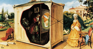
Camera Obscura was a technique used by artist to create realistic paintings. It required the artist to use a dark room in which the image would be projected, a lens and mirrors which allowed the image to go through onto the sheet of paper or a hole in the room where the imagine would be projected through in a similar way. The term was first used in the 1600s however it is speculated by artists such as Hockney that they were used centuries before that time during the renaissance.
Camera Obscura
The artist himself has stated that while painting this image he was highly inspired by surrealism (most of his art work was and his art style), this painting is a part of a collection of landscapes created by Arshile, and is based on his study of an old mill and bridge in Connecticut. It is surrounded by nostalgia for Armenia, a place he and his family used to live when he was younger however had to flee. This would explain the use of the yellow colour is such excessive amounts as he has happy thoughts of the place however at the exact same time fear because he was forced to leave it in wake of World War 1.
Although the painting might have been inspired by both positive and negative thoughts, it is mostly evoking positive vibes for the viewer, with little amount of dark tones except for the ones at the very top of the image. The overall painting can be seen as a bit messy and clustered, just like human emotions can be at times.
Essay: Did camera kill art?
In this essay I will be talking about whether camera 'killed' art and what changes took place after its invention.
Before the invention of the camera art was an ever evolving medium, this was observed by David Hockney in his documentary when he talked about the changes in art that occurred around the year 1420. Before these years art was much less detailed and extremely simplified, giving it's subjects a cartoon like look. The change that occurred might have been caused by the artists using mirrors and reflection to create much more realistic paintings than before, this process is be called camera obscura and requires the artist to be in a dim lit room while using mirrors to reflect the image of what they're painting onto canvas. The only noticeable problem with this was that the image was always reflected upside down and if anything moved outside the room, the picture would also be affected and move, making it much harder for the artist to sketch out the outlines of the image.


The two paintings on left and right are examples of how art has changed without the invention of camera. The painting on the left is from before 1400s, it has very repeatable patters on the woman's fabric that go unrealistically with each of the folds. In comparison the painting on the right was created after 1400s and has the fabric be much more refined and has many more visible shades and folds, as well as the has the patters realistically follow the flow of the clothing.
Another big visible difference is the lighting and contrast. The older painting has very bright colours and lacks detailed shading whereas the one on the right has strong contrast between the shadows and dark background and the bright colours of people's skins or fabric.
When the camera was invented about the year 1814, the world was taken by a storm and many artists who previously painted in a realistic style were out of business and not even their previous main clients such as the Church and highly seated royalties wished for them to work for them. This was because the painters took much more time and money than a photographer and not always were able to capture fully realistic paintings of people.
Because of this art has evolved into something different and instead of focusing on realism many painters chose to follow different paths. The first man to do this was named J.M.W. Turner and tried to capture feelings and emotions in his paintings. His art captured these by unrealistic use of colours and by capturing things that he saw in his imagination rather than saw in real life. This happened around the year of 1839.
Later on many artists picked up the trend of making art something more than capturing everything as it is and instead followed Turner's footsteps by making art movements such as expressionism and impressionism, both of which allowed the artists to capture feelings and emotions in pairings by using unusual settings, styles or colours most of which had metaphorical meanings behind them.
Those movements rooted out and created what we now know as the abstract expressionism movement which is all about the artist portraying their own feelings onto the canvas and that is entirely about interpretation, many artists such as Pollock even left out titles of their paintings so that they can't influence their viewer's perspective on what they should and shouldn't be seeing.
Of course art didn't only change because of the camera and tried to be as different from reality as possible, one art movement that started around the year 1950, known as the photorealism movement embraced the existence of the camera and decided to use it to their advantage. This peculiar art movement took photographs and tried to replicate the exact picture by painting on a canvas, resulting in stunning realistic art work, in which some aspects were put together to put multiple photographs into one and make it near to impossible to tell what is and isn't supposed to be on the picture an how the true photograph looked like.
In conclusion, I do not think that camera 'killed' art, on the contrary, I believe that it allowed it to expand in many ways instead of making it stay in one spot. Of course I do not think that art didn't evolve at all before the invention of it, it is quite easy to say that it was improving in its realism, however that was the only direction it was unfortunately taking. The invention of the camera forced many artists to think outside the box and create new ways to portray art, this created many new art movements that captured the real and unreal and feelings and emotions that were previously never captured because of the constant pressure for artists to concentrate on realism in their work. In other words, I believe camera let art expand instead of killing it and its purpose.