Unit 8: Developing an Art and Design Project
Introduction
For my final project I am planning on creating a short 1-3 minute animation based on the genres of horror and fantasy. My art style will be a mixture between that of modern comics and the style in which modern ball jointed dolls are made, and yet I am planning to also create environments in Maya in 3D which will act as backgrounds for my scenes (idea taken from the animation Hand Shakers but also the game Ace Attorney and Fire Emblem which like to incorporate both 2D and 3D models and animations together.)To go with the style in which the characters and animation will be done in I am planning on making the 3D environment (house) be inspired by old and new doll houses.
Statement of Intent
 |  |  |
|---|
Research
Concepts
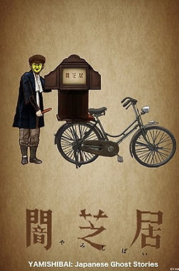
Yami Shibai, also known as "The Theatre of Darkness", is a 2013 Japanese animated series. The concept of Yami Shibai is rather simple. Every day at 5 PM a man wearing a mask travels into the children's playground followed up by him telling them a ghost story based on myths or urban legends. Each one of the four minute episodes incorporates a different story however the same begging of the storyteller arriving with his bicycle and the traditional kamishibai (Paper Drama). The purpose of the episodes is to strike fear into the viewers hearts and possibly awaken more superstition as most of the episodes revolve around folklores commonly told around Japan as a way to ensure people don't do certain things (similar to European superstition that says it is unlucky if a black cat crosses your path; however Yami Shibai would take this concept to a whole different level where the outcome would result in a huge change in the protagonists life, often times this change would be their death).
Yami Shibai's art style is very refreshing in the anime genre of animation nowadays: it's very comic-like, having the characters look more realistic than more popular anime such as Dragon Ball or Hunter x Hunter. I believe they did this to make it more possible for us, the viewers, to relate to the main characters, whom, don't have any outstanding features and are always portrayed as normal everyday people, with no super powers that may save them from the unfortunate events that may happen later in the episode.
The concept of achieving a reaction out of the viewer (such as fear or cowardice) is something I would love to incorporate into my own work. I created a similar work during my unit 4 when I worked on my short fire safety animation, however then I had the limitation of having to make the animation child-friendly, this time such limits do not exist and I am able to choose my target audience to be adults and older teens who are much more interested in the horror and fantasy genres.
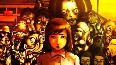

A topic that often strikes freak into people's hearts is that of the unknown. During mid 16th century England, freak shows have become a popular past time for people, often showcasing the unseen and unusual, things people were afraid to see because they feared they might in any way become like the performers. However, it wasn't until the 19th century that freak shows reached their maturity and maximum potential.
Many shows and people have featured freak shows in their art works, two of the more known examples being American Horror Story which's 4th season featured characters and setting based off of the idea as well as a compilation of songs created by programmed singers called Vocaloid called the "Dark Wood Circus" series. Both series have focused on the horror aspects of the circuses, creating effectively an eerie atmosphere by having the characters look 'unusual' to say the least. Many of the characters were not only abnormal in the way they looked but also if you looked at them from a psychologist's point of view, they were very troubled individuals with often complex personalities which I would like to represent also in my own work.
In the end I have decided to make the 'villain' of my short animation to be inspired by one of the 'attractions' that would be shown off at the circus. My ideas varied from conjoined twins to the snake person (someone with reptilian characteristics who usually performs with snakes. Unfortunately later in my project I have noticed I won't be able to go in too much into the psychology of the 'monster' that will be the final and (probably only jump scare in the short animation.) So instead I have decided to concentrate on the look. Mostly inspired by what I have seen in the Vocaloid's song.


Yami Shibai

Freak Shows


Art Style
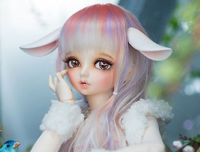
The art style I will be using to design my characters is inspired by modern asian ball jointed dolls. The dolls are highly customisable, their eyes, hair and clothes can be all changed by their owner as well as their position because of the balls tat join their body part. I have chosen dolls as my main inspiration because of films such as "Boy" and "Anabelle", both of which are horror films and include as the main threat to the protagonist a doll. For many centuries dolls have struck fear in people because of their uncanny resemblance to human being, yet most report it's their eyes that set them off the most. Since my animation will have a horror/fantasy setting I have decided to create characters that will resemble ball jointed dolls in both looks and movement.
For the animation I am planning for my models to have balls in between their joins to make it much easier to animate them, their hands and legs will move similarly to the dolls, in each frame only having one way in which the hand is modelled and gently moving only in a way the ball between the joints would allow it to. Later I am also planning to make the final model of the house also be inspired by victorian as well as modern doll houses, all so that it will fit with the style of the animation.
The problems I might experience with this style is that the dolls are 3D and I will have to design 2D characters which will have as much detail in them as the dolls (Or at least be similar enough to the style; big eyes, realistic hair where each strand stands out). the style in which I usually draw characters is very similar in the way the characters are drawn except for the joints which I will have to add to my final designs of the two main characters.
Since the dolls usually are depicted as quite beautiful I have decided that they will inspire mostly the final look of the main character. The main protagonist of this story will have soft, feminine features to show that they're supposed to represent the good force in the story and are relatively harmless, quite the opposite of the monster/spirit which will have darker colours used for them and harsher features.
Ball Jointed Dolls


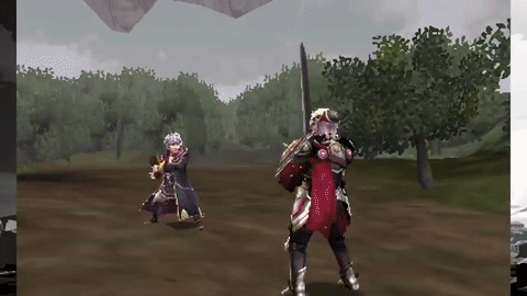
Fire Emblem
The second inspiration for my art was the Fire Emblem franchise which's new games are known for mixing very well their 3D as well as 2D scenes. As you can see below in the two gifs I showcase the 3D animated scenes and combat system. In the image between them you can see the technique I will be using which is the creation of a 3D environment and putting in 2D characters (It is not very clear since it is the strategy battle screen, however the difference between 2D and 3D is shown on the right also on the character creation screen).
I have decided to take inspiration from these games (Fire Emblem Fates and Fire Emblem Awakening) since it would allow me to show case most of the skills I have learned throughout this year, like using Maya to create 3D models and create renders of them to create stills for my scenes; and also to use and animation program like we did during fire safety unit to draw the characters and animate them (I will be using Krita to create each of the drawn shots).
This game was a huge inspiration for most of my project since from the very beginning I wished to make a 3D environment and then draw over 2D animation of my characters. This idea (unlike many others such as the settings) did stick till the very end. Some of my art style was also inspired by this game as I used the simple anime style for most scenes, similar to the one Fire Emblem uses. However I wasn't able to shade all of the scenes because of the time management so I wasn't able to showcase the art style as much as would have hoped to.
In my original idea, the animation was supposed to be based both on this game and on legend of zelda, this would allow me to construct in Maya a dungeon like environment to present both of the art style and settings fr the games better. However the idea didn't convey much horror to the viewer which I wanted to concentrate on so I changed it however the inspiration behind a lot of things still stayed the same such as the art and models.


Character Design
Monster/Spirit Initial Ideas/Designs
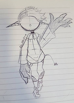


My initial idea was to go with the most common depiction of a demon-like creature. They are often portrayed in European movies such as Insidious. For the initial sketch of the design I used an art style called Chibi, used in Japanese animations, I did this because the first sketch was supposed to be a simple representation of the final project. In the end I have decided against using this design; it was not only too simple but also wasn't fearful enough (as I have asked a couple classmates for their opinions on it and they all agreed that the final design for the monster shouldn't be as typical and simple).
Unfortunately along with this design I have also scratched the idea of using western religions as basis for my monster ideas (it could possibly offend someone and it's been already done multiple times before. )
My second idea was based off of the research I did on freak shows. As I said in my research one type of performers were snake people; these people would look and interact with snakes. I wasn't sure how that would turn out since snake's don't have many defining features except for their scales so at first I created an octopus version of this.
As you can see above the design was very human like with additional tentacles.
I scratched this idea because it was too unrealistic and way too fantasy based. I do know it is one of the genres I am working with however the character looked more like something from a kid's cartoon rather than something even adults would be afraid of; in other words something I wished to avoid.
I then used another idea from my research. It was the idea of conjoined twins. Two beings stuck with one body was an interesting idea to try out, although I highly disliked the initial design I did for them. I was going off of circus theme for the outfit and their split, completely differing personalities. Unfortunately I had already drawn out the story board by this point for the events that were to happen and their themes did not suit my ideas. It did not make sense for sane and pretty looking twins to be in our protagonists vents unless they were ghosts, this is why for my final idea I took inspiration from this and make the twins much more sinister looking and more ghost-like.
My last idea, similarly to the second one, was inspired by snake performers during the freak show times. I wanted to take this idea a step further and make him a naga (half snake half human). The design however was very hard to draw (due to the tail) and it was highly unlikely I would be able to finish my project if I were to draw him in it as it would take too much time to learn how to draw the tail slithering and how it would act as the character moves around the vent which I included in my work. However this design gave me a perfect idea for later. At first it was a simple idea of hearing low hissing noise in each frame, then as I changed to my final character design I decided to also include sound, however change it to the sound of clicking.
Final Design


The process of creating the reference image for the main spirit/monster can be seen on the slide on the left. His pale skin was inspired by corpses and ghosts since the character is supposed to be a spirit who has died on the property years before our protagonist moves in. Their hair are black to create a contrast to the pale skin (the contrast making it seem even more pale). I do admit; if I had the chance to re-do this project I would have changed this characters hair to pale white since that is what hair changes to when someone passes away.
The left head (from our perspective) as you can see has a more purple than blue hint to it, differing from not only the other head but also the body they share. I did this to show case this head was sawn onto the body (which is explained in the backstory below).
I have ensured both of the heads have different expressions so that the viewer could tell
On the left you can see pose reference images I found that helped me with the pose the character is drawn in. I found them on DevinatArt a popular artist website, the poses were free to use and so I could safely be inspired by them and draw the image above.
Character personality/backstory
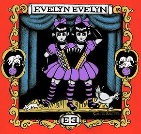
The personality and backstory for my character is based off of three different song, all featuring conjoined twins (joined either by birth or forced to stay together by experiments). The three songs are below and are called "Dark Wood Circus", "Late Night Madness" and "Evelyn,Evelyn". The concepts I took from "Dark Wood Circus" and "Late Night Madness" (Which are joined story wise) are that the twins I will be using were also joined against their will to be together as a means of experiments. Also in"Dark Wood Circus" you can see the twins usually bear a different expression to one another at most times, I wanted in incorporate that so the left and right head will always have different expressions.
"Evelyn Evelyn" tells the story of very differing twins in one body, it gets much more into the sociology point of view of the twins. I want my twins to also have a clear conflict between them (shown by the different expressions and how far away they keep their heads from each other.
Nevertheless to say I will be using in the end the idea of two conjoined twins with a conflicting personalities who were forced to be together and now haunt the house which once was where they were kept/
they are separate beings; one grieving loosing his life and the other out to seek revenge, not really caring who he will murder as long as they step into the old house.
Since this character only appears in one scene and in the mentioned scene jumps down onto the main protagonist, head first, it wasn't required for me to design clothes for them (the main focus will be on their facial expressions and hands). The clothes' fabric would also be very hard to animate from the angle the scene will happen at and (I believe) would obscure more important elements of it.
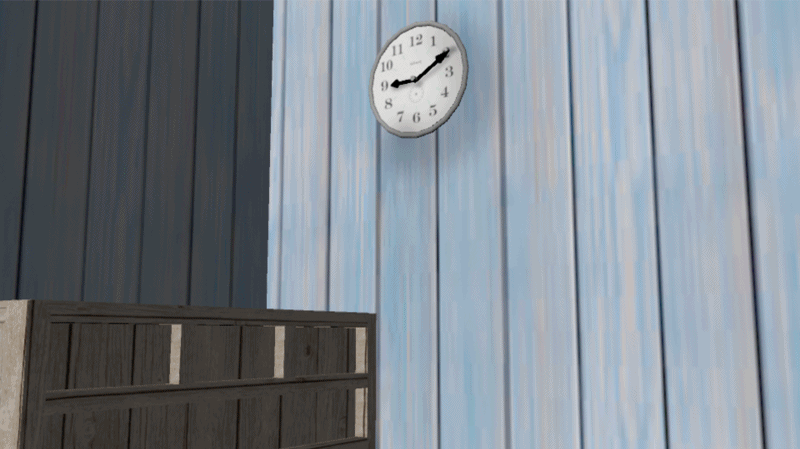
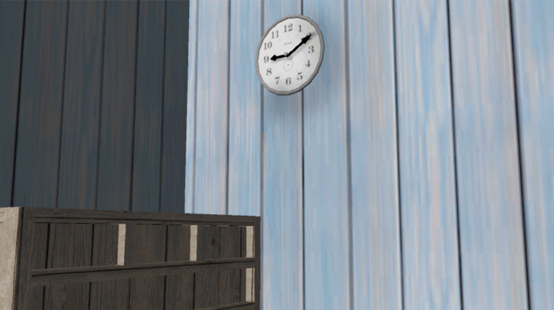
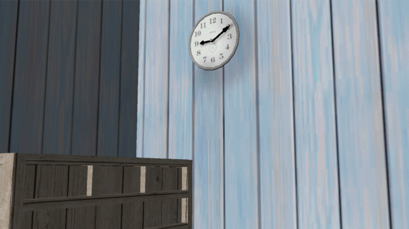
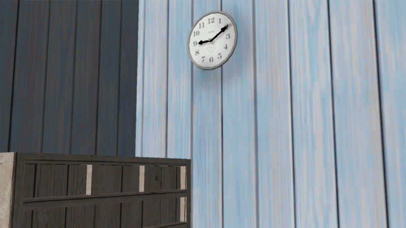
My main idea is that there will be a continuing sound of clicking/ticking. Since there will be many scenes with the clock, the viewer will be convinced that's where the sound is coming rom, however in the final scene the character is seen and their heads move in a very sporadic way, that makes their necks click, explaining to the viewer that all this time it were the twins who were following the protagonist who were making the noise not the clock (explaining why the clock scene is so insane and out of place).
If I had the chance to design this character again one thing I would change about them is I'd draw them to look more like a BJD like I said I would in my research to both of my characters. Instead this time I concentrated more on them looking scary and based them more on the characters in the songs and the anime Yami Shibai.
Main Character

Names:
-Živa (Right head/meaning: alive/ chosen for irony purposes).
-Amichai (Left head/ meaning: my people are alive/ suits Živa's name).
Age:
-16 (when became merged)
-20 (when they died)
Personalities:
-Živa during the time she was alive was a very timid and to herself child. She was often seen around her brother, Amichai and would only communicate with him, cutting herself away from any other human interactions. Not much has changed after her death, she is still the more timid of the twins and is often seen crying, remembering what the two have been through but also her brothers deeds which were always done to make her happy again, yet a smile never appeared on her lips again no matter what.
-Amichai during his lifetime was very different from his sister, very outgoing and sociable but also with a bad temper. After his and his sister's death he became the vengeful spirit and wished death upon anyone who would look at the twins in terror or scared. It wasn't because he was self-conscious, but because it hurt his sister's feelings when others looked at them like they'd look at monsters.
Death:
The twins died from complications after many experiments were done to keep them alive. The doctors weren't able to keep them alive even if they were to separate them again.
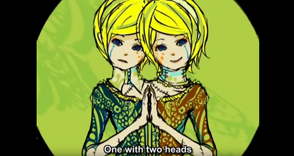
Above this the video and song of dark wood circus. The twins that I took inspiration from appear most notably at minute 1:32 and 2:30. But they can also be seen at the begging 0:19.
Above is the video and song of late night madness. The experiment idea I took inspiration from is at minute 2:48 and carries on till 4:07. End twin result is shown at 5:28.
Above is another song I took inspiration from called Evelyn Evelyn. It tells a story about the conflict the two twins have because they are together.
Protagonist Initial Ideas/Designs


My first design idea was a young woman in her 20s. Her outfit was inspired by the anime series Naruto (where fishnets are very common pieces of clothing). She was supposed to be ex military and just moving into a new house (an idea I was debating a lot through out the progress and which changed when I created the second character design but then went back to it since it seemed most plausible and realistic out of the two ideas; other being explained in second design).
In the end I have decided not to use this design. I did not like the connections it had to Naruto (An anime which I did not want to cover in my research) and the story that i have created along with it for the character. I wanted to make the character stand out more also since it was the main protagonist and it would be unprofessional for someone who the whole story is about to have a boring, bland and unoriginal design. For my next design I wanted to create something more fantasy based.
My second idea/ design was much more fantasy based and was designed at the same time as I have designed the snake based and octopus antagonists; all having a much more fantasy based designs however didn't convey well the horror idea of my project.
The setting this character was supposed to be in was much more fantasy based than the original and final ideas I have had which concentrated more around the horror genre. This explains why the character had elfish features and wore Legend of Zelda inspired clothes. The original story was supposed to take place in a world inspired by the Zelda games franchise and their dungeons which I wanted to model and then have the animation take place in. The snake or octopus inspired villain would be treated as the main boss of the dungeon. This idea however, was scraped and replaced with a much simpler and more horror inspired animation that became my final major project. The dungeon would take too long to model and by the end I would be left with no time to create my animation, forcing me to only use one sort of media to complete this project when to begin with I wished to use at least two; Maya and Krita.
The design of the character was also too fantasy based, making it hard for anyone to relate to the protagonist. That's why for my next design I took a more human based approach.
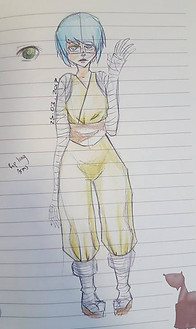
My third design was much more based off of real life. I actually went as far as basing the character of how I looked at the time. I did this so that the character would be easier to emphasise with for both me and the viewer, since they're just a normal person. What I wanted to incorporate with this design is the human weakness which I love in horror games and genre. As long as the main cast of human characters are hopeless against the creature they're fighting with if creates more tension for the viewers and makes the whole animation but more scary. In the end I decided against using this design because it was too much like me and made me feel rather uneasy I would put my characteristics on a characters for all to see, however I kept in mind the hopeless concept I've had in mind and decided to pass it onto my final design. (Clothes on this design were based off of fashion from Naruto).
Final Design


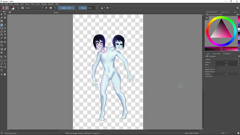
As pose reference I used the standard yet less exaggerated T pose often used by creators to show off characters design. As seen on the left you have a normal example of a character from popular series Touhou, Marisa, in the standard T pose with their hands out and legs slightly apart.
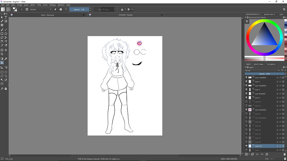
On the left you can see the process I've used for making the basic design of the main character in a drawing program called Krita. I have used a common hair colour and a hairstyle inspired by my first idea, I think that it looks quite pretty and innocent; just as I wished to convey the character, slightly clueless too so that it comes across as rather humorous at first when they don't take notice of the antagonist of the story. At first to make the character slightly still fantasy based during the sketching phase I added mouse ears/tail, however during the outlining process this was scrapped since just like during the 2nd design it would stand out too much from the story line and make little to no sense. That is why I made the final design fully human, otherwise people might mistake the animation for child friendly as well as it would take away too much attention from the actual animation; instead people would be wondering why the main character
has a pair of ears and a tail that serve no purpose to the story.
For clothes I chose random articles of clothes that I thought would look good, what the picture doesn't show because I drew the shirt too long is that the character is also wearing dark shorts that you'll later see in the animated scenes. The whole colour palette was based off of two palettes I found on Tumblr under the name 'peach'. Because of this correlation I've decided to also add a peach on the character's sweater as a print, I've added this to the more detailed scenes however didn't on the simple yet more animated scenes sine it would take too long to add to each frame in Krita.

On the left I have included images of the two colour palettes I found on Tumblr that inspired me during the time I was creating my character. The palettes were free to use or take inspiration from, I have to admit it was rather hard to combine them to make them overall look good together.
Model References


The pictures above I have found in places like IKEA's online website catalog and the general google search. These images were used to help me model most of the interior and exterior of the house in Maya. I took three reference images of vents from google search images to use since I was going to model vents which were going to be a pretty big part of the last scene above the main character's head. Each showed a different part of the vent, with one image showing how the entire ventilation system would look inside a building if it were facing the way I wanted it to (face down towards the ground (ref image 1).
I then searched up pictures of doll houses which my building was designed based off of. The doll houses had a clear theme: pastel colours. I decided to follow this theme when texturing my characters bedroom and the lower floor. Similarly to the doll houses as you can later see during my modeling process, I have made the scene almost stage-like where one of the walls is missing. This helped a lot with the renders since there was a clear source of light for them to shine on the models inside. It however made it rather hard to take angled renders in case it showed the rest of the map in Maya.
I then took the pictures of the table with chairs and bed from IKEA's website. The two reference images helped a lot when I was modeling the three things since I usually struggle with these sorts of designs.
Models and Textures
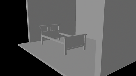
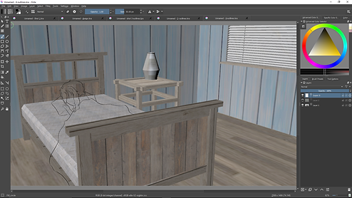
I began modelling my house by making basic three walls and the floor to create the bedroom where the most important scenes will be taking place. I then looked up pictured of beds (as seen in research above) and started modelling the frame of bed.

I created the mattress by making a simple cube then using the bavel components tool in Maya, it created smoother edges which looked more realistic for the mattress. I had to adjust the frame of the bed a bit later so that the mattress would look more realistic (I moved the frame supporting it lower.

After designing and modelling the bed I have modelled a simple night stand and a vase; things commonly found in houses someone just moved into (Which is part of my story).Overall I have planned for each of the rooms to only include essentials.

Using a simple idea of wardrobe from Ikea's website I designed it in the corner of the room where I later also will add the clock (main part of the animation) so with the wardrobe the room will feel less empty in that scene.

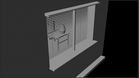
By using the booleans tool I made a hole in the wall of the bedroom to create the window. To not have to add a see through glass and background I instead added blinds to make an illusion (thankfully they made sense since it's the middle of the night in the scene.

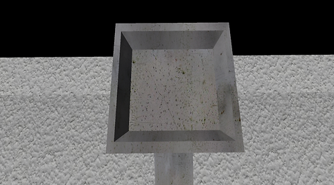
To finish off the models in the room I have added a vent that as seen in later storyboards I have decided the antagonist will crawl through by the end of the animation.
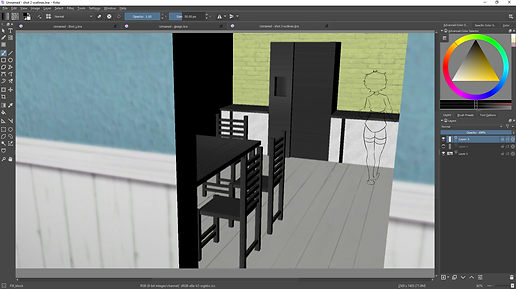
This is an image of how the room looked by the end of modelling. It looked quite empty but I knew I will later add stairs in the floor so I decided not to add any more furniture.

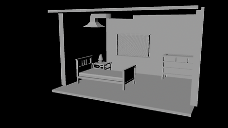
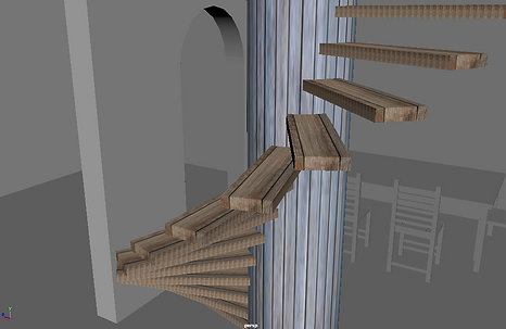
Using the booleans tool I created a hole in the floor where the stairs would later be positioned. I used a basic wood texture on the stairs and would later also use it on other models in the room.

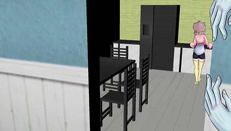
This is another render I have taken of the room; after I have textured everything inside it. Since I was pleased with the result I decided to move onto the next room which was the kitchen.
I have then added a table with chairs that I took inspiration from Ikea to make (Had to put all the pieces together just like for the real thing).
This is what the view looked like after I used the tool on the wall. (This required me to put a cube and a cylinder through the existing walls and use the tool to make the hole.
I took this screenshot to show how this scene would look like from the outside. This was because for a long time I planned to take a couple shots from the outside (from outside the window and house separately) yet this plan changed later.

Above the models you can see my research into vents so that I would model it perfectly for the animation. This is how the vent looked like before below in the end.
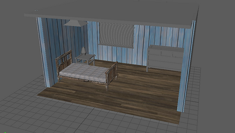
After modelling I started adding textures. Making sure to keep them quite pastel and to add no vibrant/neon colours since I was inspired by old doll houses.

I used the basic Maya Software render option to occasionally check on how the room would look while rendered. The renders came out nicely because they gave it a very pastel look often found in doll houses.

In the kitchen's corner I've added a basic counter and duplicated it. Then deleted on and in it's place created a simple fridge. These things are always found in a kitchen even when someone just moves in.
Using the booleans tool I then made a doorway which was used to connect the two downstairs rooms together.
I then put wall textures I have found from searching "sims walls textures" since the game was quite well known for the textures it used throughout the years. I've also textured the counters and fridge.

I added a simple door (using booleans tool I made a hole in the wall then added the door so it would look better). I also textured the rest of the kitchen (window/table and chairs).
I added a coat hanger and simple boxes to lay in the entrance room. o suggest further someone just moved into this house.

I was originally planning to also include a scene outside so I textured the house however this idea was later scrapped because of time limitations on the project.
This is how the house and it's rooms looked like in the end. (I used a render before taking this and most screenshot to make them look nicer and check how they'll look in the final renders.
Renders/Story Board


These are final renders i have taken in Maya. They do not show shadows of the models however I decided that it was for the better. For less detailed scenes the renders would stay the same whereas for more detailed scenes I would add the shadows using burn tool in Krita later on in the project for consistency. Overall I am very pleased with how the enders turned out. These renders also act as the story board for my final animation, each in order of the events that will take place during the animation. I still wasn't too sure on the poses at the time of finishing this however I did outline them later on in the "Basic Outline/Story Board" The clocks did not need to be included since the characters do not appear during these scenes and so 2D isn't being used.
Animation Test
This was a shot test animation to see how mixing 3D models and 2D animation would look like. I only gave it base colours instead of the full shaded effect because it was only a test animation and didn't require it.
The hair and eye colour of the protagonist differ from the final version since while I was making this test I still have not finished colouring the character's reference and was unsure of the colours I was going to use for them. I settled for blue and grey but later changed it to brown and gold.
The simple animation required 6 frames for the eye to simply close (re-used the scenes of course to save on time) so in total it required 11 for it to close and open smoothly. (at first I only did 3 for each but the animation wasn't smooth enough so I changed it).
I have later re-used this animation in my final major project with the only change being the colours and added frames later on.
On the left you can see a short gif created using 4 stills of my models, each presented using 3 different effects. The three effects I used are; burn, monochrome and the actual render with no changes made to it. At first I did this to see which ones of the frames should be used for the final project by comparing them in this way. But then I noticed that this makes a pleasant animation on it's own, that's why I have decided to also add it into my major final project as one of the last scenes.
It was also a way to text how hard it would be to make a 3D animated background (by moving the arrows in each frame). However this was way too time consuming and difficult so I decided all my scenes will simply be still scenes.
If I had the chance to do this scene again I would have hopefully made the animation smoother, yet at the same time the raggedy animation adds to the insanity of the scenes, building up atmosphere.
Basic Outlines/Story Board


These five scenes were used by me to story board the action and in what order it would go in, at the same time this story board went under many changed over time since I have kept on adding things such as the two scenes I originally used as "animation tests". The basic outline of the story was that the main character moves into a new house yet didn't check the history behind it.
Later on in each scenes you see out of the corner of your eye the antagonist of the story moving around the house; stalking the main character who is too clueless to notice them. Only in the last scene do they look up into the vents after hearing the obnoxious noise that has been following them around the house; speed up. Then the characters jump out of the vents as a form of a jump scare.
Unlike for the renders I didn't need to include the clock scenes since there was no 2D animation involved. I also didn't include second to last scene since I've already started it during my "Test Animations".
Creation of detailed scenes
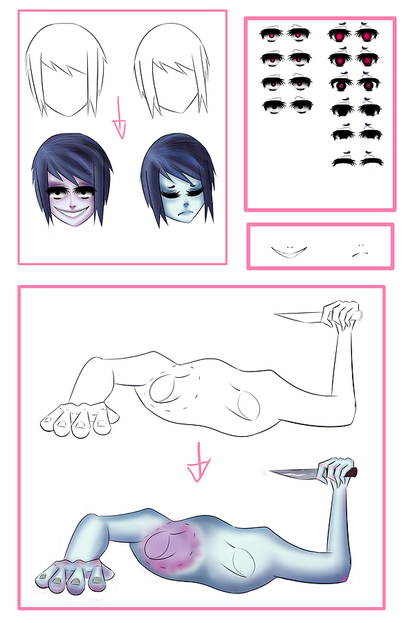
I've created one very detailed scene and this chart presents how I have designed each part separately. This layout also helped me efficiently and quickly finish the animated scene (which is the last scene in the animation where the twins just down from the vents).
As you can see firstly I have drawn the heads and hair outlines, I then shaded the skin tones and hair in. On the left to this I have made a small chart of all the eye frames I will have to use for each change in movement for a realistic feeling. The left head (male/purple) does not blink, whereas the right head (female/blue)opens her eyes then blinks, their eyes changing colour to bloody red at the exact same time (In other words the boy's eyes barely ever change except for the last few frames where the heads are inching closest to the screen (viewer/character) and it is more visible that changes occurred.
In case I accidentally saved the layers over one another I also drew out the mouths separately although they do not change at all throughout the scene.
One of the reasons the heads were drawn separately from the rest of the body was because I had to animate them move, the movement is a pretty big part of the project since it reveals that the ticking after all this time was not caused by the clock but by their heads. Each new fame I will have to change the heads positions/ their size/ the eyes I use for each head/ the size of the overall body.
The rest of the body was the easiest part for me to draw. I started off with the torso and the right hand, then moved onto the necks and left hand, later adding a knife in the right hand. The only problem I had with it was the perspective. It had to look like the twins were sliding out of the vents and onto the character vertically.
If I could to this sheet again with more time provided I would definitely try to put more expression on the character's faces, however despite this I think it worked out pretty well considering similarly to Ball Jointer Dolls they keep the same expressions with small changes happening from frame to frame (getting closer/ eyes changing). It also corresponds well with the Yami Shibai animation style with specialises in very simplistic movements from scene to scene (often times the characters keeping same expression until next scene comes or they turn around.

This is the final outcome of how the frames would look after put on the background and I added shading,. This scene will be the final scene and showcase how the animation would look quality wise if I had more time and a team of people possibly working with me. I was really pleased with the result of this scene, the light worked especially well since the shadows were positioned in all the right places and the light that shone from the window can be seen reflected on the knife and hair (as it goes darker on the right side which is in the shadows). The only thing I would improve in this scene is how the light shines on the faces as well as possibly add the rest of the body somewhere in the darkness of the vents.
Key Shots


The Key shots are opening shots to any upcoming animated scene. They are very high in detail and are kept on screen for a longer period of time so that the viewer can take a better look at the scenery and the detail that could have been achieved throughout the whole video if this was an animation made my a professional studio. They were very simple to make since they simply required me to take the outlines I used to outline the storyboard and colour them in, in Krita. At first I started with base colours like the ones I used for most of the moving animations but then I decided to take them a step further and used the air brush tool to colour in the skin and clothes and then quick_cirlce_layout tool to colour in the hair, the tool essentially works like a marker where the move you go over the area with it the darker it gets with each stroke of the brush.
The air brush tool on the other hand gently sprays the colour onto the base colour, because of which I can achieve a smooth look from the final outcome.
Text Scenes


The text scenes will go in between each key scene/animation. Their purpose is to make it more clear for the viewers what is happening and to make it easier to follow the story. To create the scenes I used an online text creator (http://flamingtext.co.uk/) it was very simple to use however did not provide backgrounds. I imported all of the texts into photoshop to add black backgrounds and size the texts so that they weren't too small for the viewer to read. If I could do this project again i would make sure that the resolution of these images was better since in the final animation the text looks slightly blurry in each frame.
Simple Animated Scenes
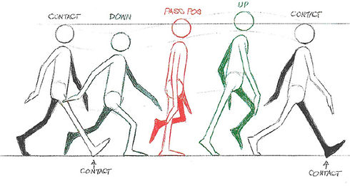

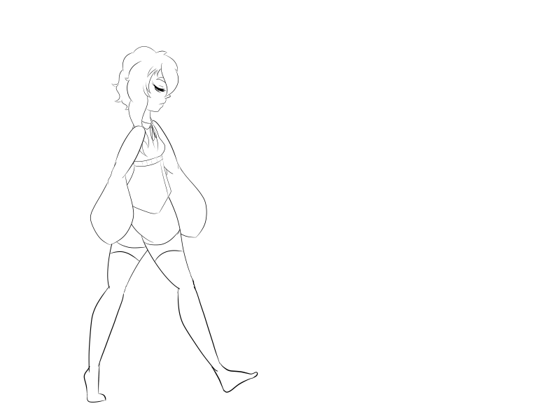
One of the more challenging yet simple scenes I have created was based on Richard William's walking cycle. The first five poses were direct references of the cycle, I then had to improvise how the continuation of the steps would look like for the next three outlined poses. Above on the right you can see my version with my main character in a straight line, I then put the seven poses over each other (similarly how the chart shows the leg should be touching the same spot each time) and on separate layers. As seen below on the left that was my first attempt at making the animation work. I have noticed at an early stage of the animation that the toes didn't look right when they were bending, almost giving the impression that my character had a limp, so I changed it when I was back to working on the separate layers. The simple animations were done by saving each separate layer on the background and then using the .png files in a program called PhotoScape which allows you to make simple gifs while still maintaining the same level of detail in the final image. After fixing the problems I originally saw with the line art, I put a layer under them and coloured them in with base colours. As seem below on the right that is the final result of the walking animation which I am quite happy about since don't see any big anatomy errors and the animation looks quite smooth. The frames are set to play at 0.15, allowing there to be 5-6 frames per second.
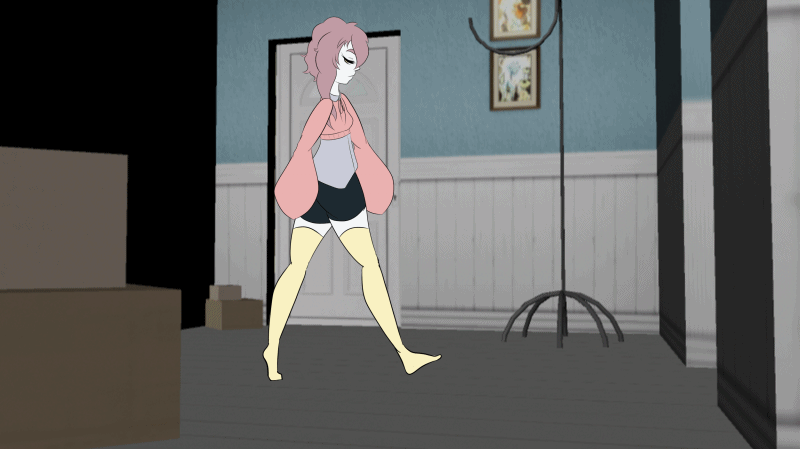
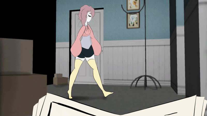
The animation above is the final result of the walking animation, I have added the twins holding a book (presumably about the past of the house) because otherwise the scene wouldn't make sense with the text that appeared to explain it. Of course the character is quite oblivious to everything going on until the last scene.
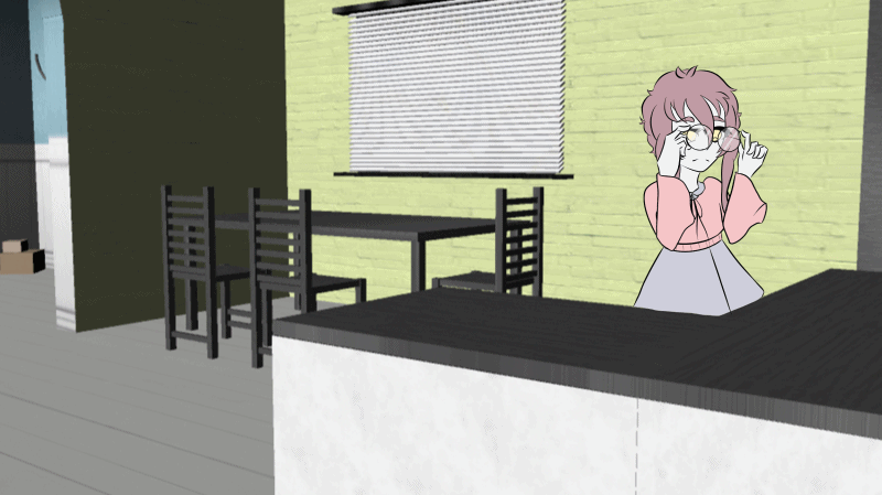
This is the start of an animated scene I did. It's the second scene, where the main character is in the kitchen and puts on their glasses. I then later added a cutting board onto the counter so it's more obvious why they're there and a hand sneaking from the door, to show that the twins are still observing her every action.
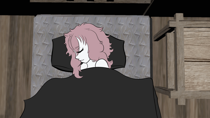
The two gifs above are both from when I was mostly working on the tree final scenes; the character waking up and looking up/ the clock scene and the twins appearing fully at last. The first gif was still before I completed the final scene, it was a test to see how smooth the animation looked, when I finally got the timing right and was pleased with the result I finished the most detailed scene and added it (as seen on the right). The biggest issue with the scenes was making sure that it's obvious the character is blinking in the last scene and that is why the images go in and out of focus as well as having to make sure the blinking time is quite realistic to someone who has just woken up. The animating process of the eyes blinking and widening as well as the pupils dilating was relatively simple since I only had to make the process for one eye then just copy and paste the other and use the vertical tool to change it and it's size (the face is never perfectly equal on both sides so I had to take that into consideration when making the eyes).


On the three gifs to the above and left you can see how I slowly developed my final animation. Adding more scenes each time as well as the text scenes and key scenes. During this process I was still testing if I could swap the placement of the scenes and whether they would look alright, however in the end I settled for how I planned them using my key scenes at the very beginning. I was also playing around with timing in PhotoScape, making sure in the end I knew hoe long each scene would have to be and how long each frame would stay on the screen for it to flow naturally.
Sound Effects
This is a sounds effect I found on YouTube of knuckles cracking. It is not too strong and can be easily mistaken for the sound of a clock ticking. This is why I chose it as the sound that will play throughout the video; the viewer will be under the illusion that the sound comes from the clock however it actually comes from the twins.
This second video I have also found on Youtube. It came up under the same search of knuckles cracking and since it was much more concerning sound vise I decided to use it in one of my scenes where the character moves their fingers against a door frame. The sound would make any viewer quite concerned and give them a hint that it's the twins making the noise.
I chose this sound effect for before the first scene appears/during the explanation texts and ending at the first key scene.. The sound will suggest that the character has just entered the room and the next frame will present that. The sound also fits the animation since it's quite eerie. I found it on Youtube and decided to include it in my final animation.
This is an audio clip I found on YouTube. I thought it was perfect for the scene where you see the animation from the twins' point of view and hear their heavy breathing because of how close you are. It will surely make the twins appear as much more of a threat and much more scary.
This is a very short clip of a jump scare sound that I will possibly use for the final scene where you see the twins jump out from the ceiling to add to the atmosphere. The sound will change from the music that played until now to this and the viewer will not only be surprised by the change of visuals but also sound.
This is a piece of music which will play throughout the entire animation. I especially liked the first few seconds so I will repeat them before the buildup and the final scene comes on where the music will change the the clip on the left. This piece will be played over so it'll be quite subtle until it's build up.
Problems And Solutions

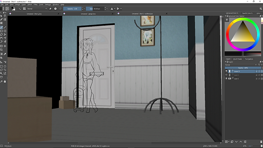
The main problems I have experienced during this project happened after I have finished my animation. After planning it out using Photoscape I have decided to put it into Windows Movie maker, as seen on the screenshot on the left. I have planned for the timing to be the exact same as the one I did in the gif. I had to put it into a different software because gif makers of any kind don't allow for sound to be input into the final product. After getting the sounds perfectly on time I have unfortunately noticed that because I was using the free trial version at home I was unable to change the format and so wasn't able to upload it onto my website. This made me take the decision to in the end make two final videos. One which will be made in Photoscape, without sound yet correct timing and one in a program called IMovie which allows me to get the sound in however doesn't necessarily get the timing right.
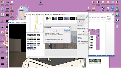

On the left you can see me working again on the gif in PhotoScape. The screenshot shows me typing each of the frames separately making sure that they don't stay too long or short on the screen. The animated scenes would usually be timed at 0.15 second to make them look smooth but not the make the characters seem rushed. The scenes with text that explains the story that is happening or with the key frames (which let you take in the scenery or how the animation would look like with a budget and a team behind it) both are 1.50 second long. In the end the final animation was about 47 seconds long, off the mark I gave myself to make at least a minute long animation however I didn't want to complicate the story further and possibly make it too hard for the viewer to follow the events. I then saved it and posted it on a website (DeviantArt).
To make sure I could safely upload it on an pc over to Wix no matter how much I would change it I uploaded it into my stash folder on the website. As seen on the right screenshot the arrow points to the saved gif inside the folder. I could then easily upload it to the website and change its format. Unfortunately I wasn't able to put the already done animation into the IMovie program like I have hoped to and just add music. No matter what format I tried to change it to the IMovie only accepted it as an image. After trying every format that IMovie accepts (MP4, MOV,HDV, AVCHD and some others) the same problems occurred. In the end I simple redid the animation however knew the timing won't be as specific as it was in Photoscape. The fastest Photoscape allows you to input a frame is at 0.01 whereas IMovie only allows for 0.1. This was a huge change I had to deal with since the scenes wich previously were 0.15 second long were now only able to either be changed to 0.2 or 0.1. I chose the latter.
The animation because of this was much quicker and only lasts about 40 seconds, however I was able to input sound in and at last came up with the final product which you can see below.
Two Final Animations
My Channel


final
The gif and video above are my two final animations which I completed during the 2-3 months of this project. The animations just as planned were created using 3D models and 2D character designs and animation. Although having 2 final animations was not my plan I quite enjoy the result as it shows two possible ways of creating the animation and how those two changes (speed and noise) change the setting completely. I am very happy with both the PhotoScape result and the IMovie animation yet I personally do prefer the atmosphere IMovie has created with the simple addition of sound and more quick paced animation. In the end I am most proud of the final scene, however do realize I could have paced its upcoming better and put in a better sound for a jump-scare now that I look closer at it, it doesn't exactly give off the scary vibes. This isn't a huge problem however since it means the animation can be viewed by a larger amount of audience such as adults, teens and kids, not limiting anyone.
Story Explaination
Since it might be quite hard to follow the story from only key shorts which acted as my story board I have decided to dedicate another section to explaining my projects and the narrative that is presented through animation and small amount of text.
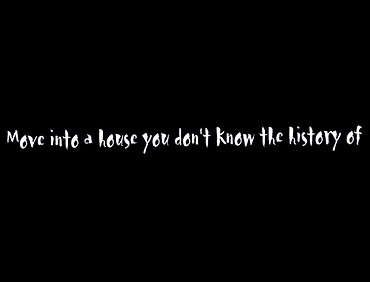
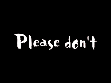
Scene 1 (Please don't move into a house you don't know the history of) : In the key shot you see the main character, a rather clueless and obvious human, with a suitcase by her side, suggesting she has just moved into her new apartment. The surrounding her cardboard boxes and sound of doors closing hint to the same assumption. In the animated sequence that follows we see the character move from this room to the kitchen, we don't know that at the time but we will see the next room in the next two scenes. While she is moving through the room and door way, from the bottom of our screens we can see a book slowly come into view. The book doubtlessly contains the history of the house which the main character ignores, meaning they ignored the first warning, the scene almost presents itself as a metaphor when the two blue hands of the twins show up. Bordering on appearing desperate to show the character the book, showing the personality of the female twin who never wishes to hurt anyone unlike her twin brother. The warning is ignored, left unseen.
Scene 2 (Please don't look behind) : In the key shot you see the hands of the twins clutching onto the door frame, observing the character from behind who is positioned in the kitchen. You'll be able to realize at this point that in both scenes you were looking at the character from the twins' point of view, possibly the female one because if you read her bio you notice she was the gentler of the two and mostly likely is the one also setting these warnings up for the character, trying to help and going as far as trying to sneak in the book to help out. Thankfully the character doesn't turn around and follows the instructions, however the twins are shaking, as if with anticipation to strike at any given moment. In the back ground you can hear the soft yet exasperated trembling breathing supposedly coming from the male twin who is close to loosing his cool. The whole image shakes expression further the fact one or both of the twins is shaking and their knuckles crack (I've added a special sound effect to emphasize this when then tighten their grip on the door frame).
Scene 3 (Please don't look around): Quite the similar title isn't it? A similar situation occurs to the one in the previous scene however no longer from the twins' perspective. This time the camera focuses on the main character and her everyday life activities; while in the background you can see the twins hand slowly moving across the door frame to create an eerie affect. I did not add any additional sound other than the music that always play in the background for this scene as it seemed unnecessary since neither of the characters do anything that'd cause noise.
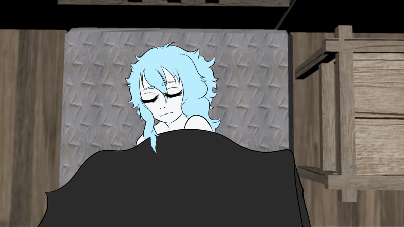
Scene 4 (Please don't look up) : In the key frame of this scene you see the character laying in their bed seemingly fast asleep, yet even before the animation starts you can tell something will go horribly wrong because the clock scene start to play, giving off an uneasy and insane vibe for what's upcoming. We (the viewers) go back to looking at the character, from an unusual perspective looking down at the character as if we were hanging off the ceiling as we watch the character slowly wake up from their slumber clearly distraught by something, possibly a noise or an uneasy feeling, yet again nothing but the usual music plays yet it picks up in pace and volume creating a spine-chilling tone.
Scene 5 (Their necks have been clicking in anticipation) : At this point you're still in the same point of view and see the character move to look up at what's been disturbing their sleep, her head moves to look at the ventilation system and her eyes widen, pupils dilate in what you can only assume is shock and terror. The music speeds up and the tones go lower to create an even more disturbing impact when you finally see the camera change angle to what you can only imagine is the perspective of the pain character. And at that exact moment you realize that in the past few scenes you've been staring through the eyes of the twins, yet now they're staring right back at you, the music changing to that of a quick paced jump scare, their necks clicking with each twist and turn as they fall from the ceiling onto you, the screen then fading to black and the music stops. The only thing left to the imagination is what happened to the main character after the attack.
Unused Ideas
There were two major ideas I had while creating the story that I have unfortunately not been able to use in my final animation. First of them being the idea of a more fantasy setting, much more inspired by franchises like Legend Of Zelda and Shadow Of the Colossus. It was supposed to take place in a dungeon/temple -like setting where we see the hero of our story explore the entire building before finding what we could only assume is the final boss of the area. The horror element of the story was actually hidden until the very last moments when after a fight I would animate the boss wins against the hero and in a gory fashion kills him. There were many problems with this idea however, the main one being that gore isn't often the most successful use of horror and for most people nowadays isn't considered horror at all! Another problem was that the temple/dungeon environment would be very hard to model and texture in such a short time. This is why I left this idea behind.
The second unused idea I actually had planned while drawing out a small story board on paper. The idea was a secret ending which would appear after a few moments after the twins' attack the main character; it would reveal that actually the characters were just dolls being played by a small girl by the doll house (the house I used for my animation). I really liked the idea however after getting feedback on it I have realized that it would completely take away both the element of fantasy and horror from the animation, unless I added another scene where the dolls come to live by themselves and wave towards the viewer. Those ideas were scrapped however because it'd require even more modelling in Maya (I'd have to add a huge room where the doll house would be), the design of a new character, and a lot more animated scenes which I simply did not have time to add.
Evaluation
For my final major project I have planned to create a 1-2 minute animation using multiple media such as Krita and Photoshop (art programs which allowed me to draw the 3D scenes and add slightly after effects to each scene like shadows and light), Maya (used to create my 3D environment and simple renders) as well as both iMovie and Photoscape to create my final animations, based on fantasy and horror genres. Most of my ideas for my project came from popular media: shows, games as well as animations. The major two inspirations for my project were Yami Shibai (Animated Show), Fire Emblem (Video Game). I have also taken notice of real life events and popular trends, yet again I’ll name two of the main influences: Ball jointed dolls (A popular brand of dolls, which inspired my art style and main character) and Freak Shows (Popular form of bizarre entertainment; inspired art style and design for antagonist). I believe I was successful in my final major project and met the requirements I put for myself while planning it out although many changes have been made. One of such changes was the time it take for the animation to play out, it was supposed to be between 1 to 2 minutes long however I had to change that due to time restrictions. Other than that I was very pleased with how it turned out.
I believe my research turned out to be quite successful since I was able to gather images and information from many different places, photographs, exaggerated posters, screenshots and digital art just to name a few, all which gave me insight on different aspects of my work such as art, pacing, character development and environment design. The most relevant research I have done was my research on the Fire Emblem games which helped me in incorporating both 3D and 2D together and taught me how to use one without overshadowing the other. Throughout the project have relied heavily on subject knowledge since I needed it to model all of the environment and used it for my character designs and ideas on how they should act and how the story should progress.
After my research I have moved onto the development stage of my final major project. At first I decided on writing down short texts on black background which would be the foundation of my story, they would explain what would happen in each scene. I then have started designing the interiors of each room and the outside of the house. And finally in the end drew out the key scenes in Krita. Throughout the project I have decided to make the final outcome right after I finished the story board and had a clear idea for the story in my mind. The methods I have used to create my final project included working with many programs such as Maya to create and texture the models then their final renders; Krita and Photoshop which I used to create my 2D animation frames; and finally IMovie and Photoscape to put everything together into a gif or a movie with audio input. In Maya I had to use a variety of tools such as the Booleans tool and adding textures. I was able to fulfill my statement of intent using these methods because I have put most of them in the statement and followed through with it. I would be able to do my environment in class and create the 2D animation in my house. In most cases these methods were successful because I was able to everyday work on both aspects of my work, even while my environments weren’t finished I was still able to work on the character designs at home, this was also a huge strength of this method, since nothing was stopping me from continuously doing both parts of the project at once. The biggest weakness of working this way was definitely the probability of my home computer not being strong enough to keep all the files together at once, meaning I had to keep them on my USB at all times in case something crashed. I don’t believe I would have changed a lot about the way I have worked using this method, it was very reliable. The characteristics of my work are the methods I have used to differentiate between the key frames and the animation, giving the final product a rather smooth flow as well as how I combined the 2D and 3D elements. experimented with many different art styles and character designs as well as pacing of the animation near the end when I was putting each key scene together. During my work on the environment I have also experimented with different textures and renders, settling on ones that would most likely suit the doll house atmosphere I was going for. The biggest change during my development was the changes I have made to the story board, which beforehand contained a secret ending where the characters turn out to be real dolls and are played with by a small girl. All of this helped to develop my project through a small journey of my testing what would work and what wouldn’t and was simply too ambitious for the small time I was given to create my project. My biggest problems were definitely working with creating the storyboard which I had to change multiple times due to time management. In the end however I was very pleased with how it turned out although I had to cut out a couple key scenes I would have liked to have kept.
Originally the audience for my final major project were my peers and adults considering the horror and fantasy genre. However in the end the project turned out to be less frightening than expected so my audience turned to any age group. I expect the people who do view my final major project to go through my wix website unit 8 and hopefully in the very end watch the final video of my project. I hope that my audience not only enjoy and get slightly frightened by the video because of the ending jump scare but also give me constructive criticism on how I could improve next time I work on something of similar scale. My final major project does not entirely follow through with the original statement of intent, the two main changes were: the name (I originally called my work the “Shining Man” however ever since the concept changed multiple times I changed it to “The price of the oblivious”) and the timing (originally planned to be 1-3 minutes long however changed to below 1 minute mark).
I believe that my work ended up having a satisfying result, although many changes such as the title, story and timing had to change due to time restrictions and constant new ideas on how the story should take action. My peers that have seen the full outcome gave very supportive criticism, only main problem being the multiple sounds at times over lapsing too much. In the end I am very pleased with the final outcome of my project although I wish I could have put more detail into the key frames. My diary played a huge part in helping me keep on track of how fast I had to keep creating my work however at times I did have to go against it and focus more on one thing than the other.
I planned carefully to plan out my time in college by working in Maya to create my renders and at home to create the characters, work on my website and animation. At most times I did follow my time table however when I finished my renders I had to do wix at college instead of at home; that was the only change that took place.
If I was able to do my work over again I would have definitely put much more detail into the key scenes and would add the additional scenes that I was originally planning on adding to my work. Other than that I am very pleased with the result of my final animation.