Unit 5: Fire Safety Animation
Research into Safety Videos
The first video I have looked was titled "Charley-Matches" and was a short 30 seconds film which presented a cat and a boy playing with matches, the short video's purpose was to show younger viewers that it is dangerous to play with matches and always ask an adult for help if you see them.
The main narrator in this short film is the cat, who's name is Charley. His words are translated by his owner, a young boy. This was most probably made because kids are much more entertained by animals and are more likely to listen to it than an adult, like the policeman, this is because they find them rather boring and unimaginative; they would rather rebel against them than follow their instructions.

Using Flash for first time

The colour used are rather dull and boring, however that is expected from a film that is quite old. The Autumn colours fit in perfectly with the theme of the video as red, orange and yellow are colours often associated with fire.
The video itself is motivating the viewer to take precautions when playing with matches by using fear. Usually videos from this series such as "Charley's Tea Party" show the consequences of what the cat does, for example how injured he is after hot tea is spilled all over him, however this video decided to go a more safe route and instead showing something burn, it showed the cat simply telling off the child for playing with matches, making the film much more child friendly.
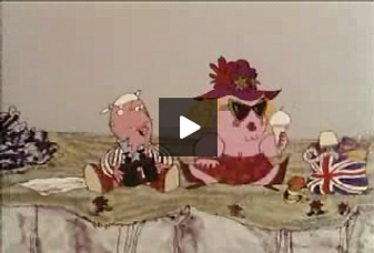
The second short film that I have looked at as a means of research was the 1968 video called "Joe & Petunia- Coastguard". The point of the film is to show the viewers what to do if they see any boat that might be in distress, in other words to call 999 and ask for the coastguard.
There are two main narrators in this video, as the title suggests it's about Joe and Petunia, who are on a current holiday and throughout the video keep having a rather normal yet comedic conversation. The style of this short movie and its humour is targeted towards any age group, despite using cartoon as it's style and not live actors. The couple was most likely chosen for this short because of how relatable they are to general public with their off handed comments on everything and a rather neutral outlook on things.
The colours used are quite dull yet much more colourful than in any of the Charley's movies. There is a greater variety of colours, however the couple's clothes (which are a deep red colour) are quite the contrast to the blue that we see whenever the shot cuts over to the drowning man out in the sea.
This was probably done since the two are contradicting colours and are usually considered opposites of each other, in this instance it would symbolise the land and the water/safety and danger.
This video unlike Charley's is not created to consume the viewer with fear or guilt but rather look on the humorous side of things and present the danger in a light hearted way. This could have been done so that it is easier for the viewer to remember the scene and the message it carries along.
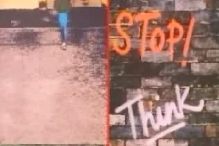
The final short film that I have looked into was named "Close to the Edge" and was created in 1983. The point of the videos to tell it's mainly teenage and young viewers not to step out onto the road when they are walking.
The main narrator is out of screen, singing his lines which are directed towards the viewer and the young boy in the video. It uses live action however with very saturated colours so that the video looks like pop art which was very popular at the time. There are rare times in the video where you also see short animated sequences with shoes moving into and away from the edge of the road. The combination of the two (live action and animation) makes the video much more entertaining and gives it an almost music video like feeling.
The lyrics are very memorable and simple, making it easy for the younger viewers to be not only entertained but also sing along whenever the video is played, it also makes it easier for them to remember it and its message.
The colours are very similar to the ones used in pop art however quite duller, this might be caused by the age and quality of the video and not the intentions of the creators. These sort of colours make it much enjoyable for the young viewers and the music playing is very upbeat and repeatable, making it easy for the song to get stuck in someone's head.
This video's main purpose isn't to be frightening, its purpose is mostly to be entertaining for the viewer some like the second video I have analysed. The song is very catchy and would be stuck in most people's heads, it's a very smart way to make children remember things like looking both ways before crossing the road.
Colour and character design research
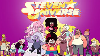
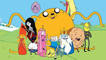

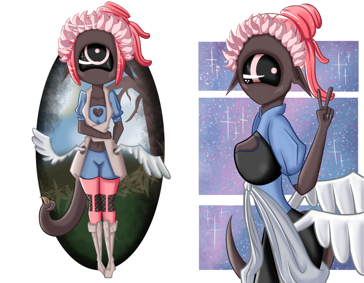
To create my main characters I have taken a look at different shows that are very popular with kids and teens nowadays. This allows me to get a better idea of what style I have to use to catch the attention of younger audience which the video will be directed at. The main thing I have noticed about the cartoons I have looked at (Steven Universe, Adventure Time and Star vs the forces of evil) is that they often use bright and pastel colours with minimal or no shading.
Steven Universe (picture 3) and Star vs the forces of evil (picture 1) also use very big eyes, which show most detail out of all of the design of the character. This rule is not followed by Adventure time which makes them simpler and makes them very basic dots.
Because of this I have decided to make my character have a basic design, with large eyes (which make the characters look more innocent and child friendly).
The clothes the characters wear are quite simplistic and often lay perfectly on their bodies to make it easier for the animators to animate them since there are no folds on them and they wont exactly move with the character. The exceptions for this rule are at times skirts and dresses.
Because of this I have decided to give my main character very basic design which will consist of shorts and a plain t shirt, so that the animation is smoother and simpler.
The hair which characters have are usually the most important and vibrant and varying part of the design apart from the eyes. They show the characters personality of the character; with large hair showing off a more bold personality and short often representing a more shy or outcast persona. However the same personality can be conveyed by a character with long hair which cover most of their face (this makes them seem mysterious and rather closed to the outside world).
I decided to make my character have long hair, down to her waist, to show her confidence and make her a figure which the children and teens would want to follow. I also observed most of the characters (mains) are about 12-16 years of age, making them close to the target audience age and much more relatable. Yet again, following the trends, I made my character about 14 years in age.


Wanting to try out more simple animation, at hime I used the Krita program to draw a rather simple character and add simple animations to her overall drawings. I drew each from of the wing, leaf and sparkle movement separately since the program did not allow me to use keyframe animation. The program allowed me to draw in much more detail than Flash and was simpler to use, however lacked the animation and gif feature that Flash has. Because of this I have had to use a separate online gif creator called GIFMaker.me, link: http://gifmaker.me
Although the quality was higher than that of what I created in Flash, the simple animation took far longer to create.
In the end I decided that I will try to use both, Krita and Flash together for my final project, to create the best quality animation that I can in the limited time span.
Another problem I have experienced while using Krita with GIFMaker was that the quality of the image became much worse when I converted the image into its animated format. As seen on the pictures above the detail in shading, lining and brightness is much higher on the non animated picture than that in its animated counterpart.
Krita+GIFMaker.me

Krita+Photoscape
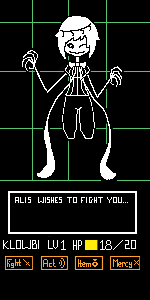
Using both Krita and Photoscape I created two very simple animations. The first animation I have done using these two programs was rather easy to do considering I have used limited colours and pixelated style inspired by the popular game titled 'Undertale'. I have created the character and its sprite myself and drew the background and surrounding visuals based off of the actual game battle scenes. The animation is a simple 3 frame loop, which involves three simple aspects of the character moving; its left eye, the eye on its head and its bowtie which acts as its legs. It also involves it slightly moving up and down along with the movement of its 'legs'.
Final main character designs


Considering the animation was done in pixels instead of smooth lines (which are done by the pencil tool) the images don't loose as much in detail as they did in the previous animation when put into action. However since it was done on a smaller scale canvas it is much harder to scale it into bigger size without loosing the smooth look it might have while in its smaller form.
Another animation I have done while using these two programs was a simple blink animation. For this I used smoother lines instead of pixelated art to see if the quality also stayed remotely similar before and after putting the frames into an animated gif. As seen below the three frames created a rather simple animation. The quality of the gif stayed the same as it was when they were separate images.
The only problems I have encountered with using these two programs together is the fact that Photoscape isn't able to handle longer animations or images with high resolution. Because of this the animations had to be limited to three frames only on repeat and both had to have images of small scale.
And yet again I was forced to draw each frame separately. Fortunately Krita has a tool which allows the layer to be duplicated and blended away which allows me to see the image underneath (Which I have to draw over and make simple changes to, to create the simple animation).
At first I started off with the simple sketch of the body type the character will have; basing the model of the head on that of other popular characters such as Star from Star vs The Forces of Evil. The rest of the body is smaller in comparison to the head so that the character gives off a more cartoony vibe. I decided for my character to be female because of the recent growth in popularity among female MCs.
I then (in a different colour) sketched the basic outlines of her hair, eyes and clothes. I decided in the end to keep her hair long at the back since it usually shows confidence in characters as well as keep the front short so that it does not cover her clothes. I decided to keep her clothes rather simple and leave her without shoes since most of the story will happen inside her house.
I made her eyes wide and large to make her more likeable,
Rotoscoping

Rotoscoping is a animation technique used by artists. It allows you to take a live action film image and draw it out in your own style. The original rotoscope was a projection equipment that showed the live action image on a glass panel, allowing the artist to put paper over it and draw over it. Now it is used by nearly all art programs, allowing the artist to trace projected images which's visibility you can turn down and put another layer over to efficiently draw over the original.
The rotoscoping technique was originally invented by a man named Max Fleischer in 1915 and was used by him in his animated series called "Fleischer Process" for screen credits only. The process was for the longest time exclusive to Max Fleischer and his studios used it in their later works such as: Betty Boop, Popeye and Snow White.
By 1934 the exclusive expiration on rotoscoping has run out for the creator and other animation studio's were able to also use it; one of which was studio Disney. Walt Disney and the animators working for him have used the technique in one of the most nostalgic movies, "Snow White and the Seven Dwarfs" in 1937.
The most recent feature which used this technique was an anime called "The case of Hana and Alice". The entire movie has been firstly filmed in live action then animated using the rotoscoping technique in 2004. In 2015 a very shot animated horror named "Kowabon" has also used this technique throughout the whole anime.
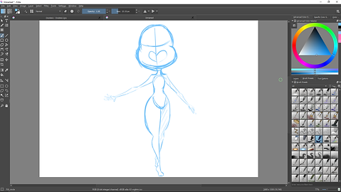
The first time I have used flash we were required to make a simple image using the tools available in the program. Using the brush and pencil tools I reacted this image. Since Tablets were available to us at the time too I used that instead of the mouse since I have had past experience with tablets and never drew with a mouse (you could say I felt like a fish out of the water while using it to draw).
I only used one layer at first, drawing the simple head shape and hair, later on adding the details such as face and the rest of the body. The biggest difficulty I have experienced while using flash is how lacking it is as a program that is supposed to be used for art purposes as well as animation. It is very hard to use the eraser tool since you have to turn off others layers other than the one you want to delete sections on or you'll be erasing everything that the tool touches, and yet if you turn them off you won't be able to see how far you have to erase the paint tool.
This is my very first animation that I have done in Flash. It is a simple animation of a ball bouncing up and down on a loop. To create this I have made a circle using the paint tool then in different frames moved it up and down. As it touches the 'ground' it becomes more and more squashed to give off the illusion of the balls texture changing on impact of hitting the ground.
The whole animation took me about 20 frames to make which explains why it is rather slow in movement however high in detail. In each frame the ball is moved slightly up or down depending on the sequence of time events.
During the production I have made a slight mistake and not kept an accurate estimate of how large the ball was when it first started off in the cycle, so there is a point while it is in the air and it suddenly changes side when it loops around.
This is the second animation I have ever created only in flash. It was supposed to be another practice of the bouncing ball however I couldn't help but want to try and be more creative with it. Because of this, the final product is about 120 frames long and can become quite buggy at particular moments because at the time I still didn't have a perfect understanding of the program. I decided to use one solid colour to animate every part of this animation so that it is a faster process and isn't too complicated.
I an safely say that although it is not my best animation, I am very happy with it as it was the first animation that I have created that is so long. My only regret is that I have not spent more time on it to make sure there were no mistakes and that I would have made it a perfect infinite loop.
I would have also made sure that the text was much more readable and stayed on screen for longer so that the reader wouldn't have any difficulty reading it, adding lip movement while the text appears would also be a great future addition.
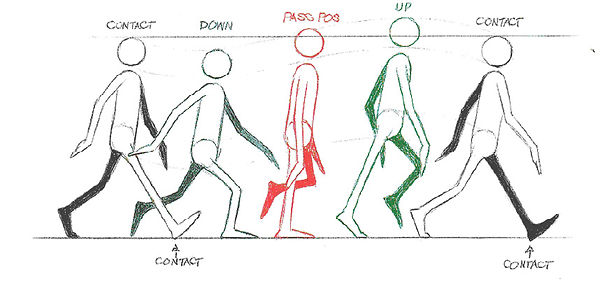
This is my short animation that I created by tracing the chart created by Richard Williams. Each one of the frames have been traced over in black colour on a different layer then put together using flash animation. The process was reasonably simple to complete since William’s chart was quite dull in colour and the quality was low compared to the vibrant black lines I was drawing over it so it was easy to differentiate between the two and not accidentally leave any blank spaces. Looking back at the animation I’ve noticed that between each frame there is a gap where the animation goes blank, however the original scrip did not contain any additional frames in between that’d cause this so I am unable to fix it currently.
Overall I am quite happy with how this turned out, it was my first full body depiction of a character where I also have the pleasure to animate them move, my only regret is not making bigger changes to the original. If I had the chance to do it again I would have gladly given the character more characteristics to make them unique such as hair or clothes, potentially also adding colour to the entire animation however I know it would take much longer to produce.
The picture on the right presents a famous walking chart created by Richard Williams, this image can be either found online or in the book created by the artist, Animator's Survival Kit. It is often used by artists as simple reference of how their character is supposed to move while taking a step forward, the structure of the body as well as how it lowers while the person goes to take the step is all draw in an easy way and can be traced over by anyone either by putting paper over the original picture and drawing it traditionally for five pages or digitally by putting on top new layers and drawing over yet again. Of course the image is also simple enough that even an intermediate artist can copy it by simply looking at it. The put more detail a person can draw additional frames in between.
My attempt at Rotoscoping
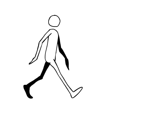
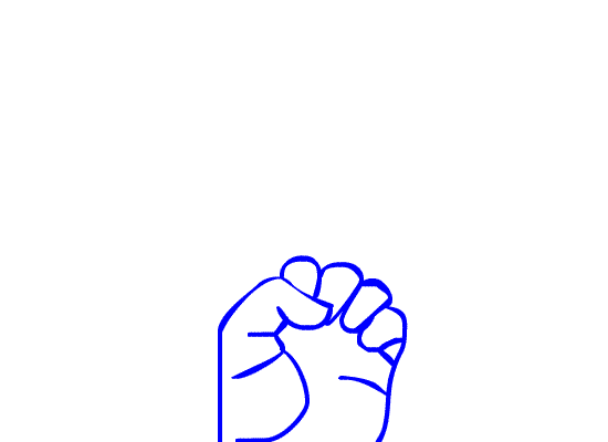
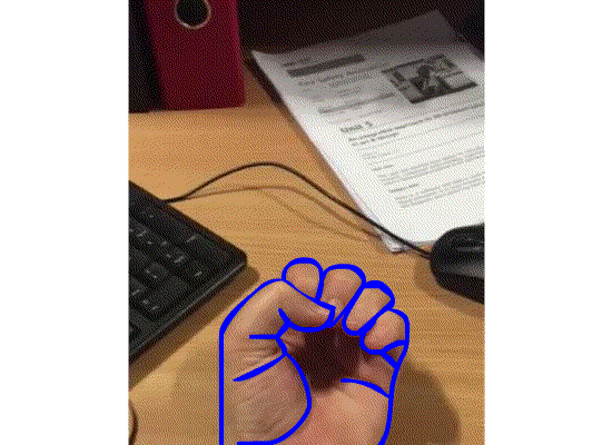
For my rotoscoping practice I have used a short 1-2 second long film of an opening hand. The simple animation required 16 frames and made me much more understanding of why all animators considered it so time consuming especially taking into consideration that they were required to not only do simple outlines but full colour and an animation which lasted for minutes and sometimes hours.
Unlike in animation I have not drawn the first from then copied it but changed it slightly each time. This time I had to draw separately each frame and draw each one of the lines again. This allowed for a move accurate representation of the original live action however also gave a shaky, jellylike end result.
On the left you can see the outlines drawn over the live action of the opening hand, whereas on the right you can see the lines alone; the final animation. I really enjoyed rotoscoping as it allowed me to use different mediums to create the final product (live action camera work and later the art program Flash).
Final Animation


Basic Sketches
Outlines


Backgrounds


Characters + Detail


I’ve also research backgrounds used from more popular cartoons such as Adventure time, Steven Universe and Star vs The Forces of Evil. The backgrounds at often times consist on red, brown or black outlines and range from vibrant to pastel settings all depending on the atmosphere of the scene.
The scenes also use either the pan tool or the marker tool (which makes each stroke of the brush darker over) which I've decided in the end to also use in my final product animation.
Background research
I began by lining out the top of her head and then going down, it allowed me to quickly finish part of her body such as her front hair and eyes. The base colour for the hair was pink since it is still (after all these years) most common favourite among female audience and the green eyes came later due to magenta and green being complimentary colours.
I picked a darker skin tone than characters are usually seen with to appeal to a larger amount of viewers, for this exact same reason I also gave her slight freckles that you can see in this close up of her face as I was working on it. At the same time I finished her eyes (admittedly I was not able to make them this detailed in every frame later in the animation,
I then outlined her outfit and the rest of her hair. Having the base colours of her eyes, skin and hair down I was able to work on her outfit so that it suited the colours previously chosen. The biggest problem was trying to outline the clothes since I had to research how each article would fold on her body, after a bit of research I noticed how other animated characters usually have them stick to their body or have slight folds at where the body bends.
After doing the outlines I have finished the hair and, admittedly, added many details that'd be deemed unnecessary in animation since they'd be very hard to incorporate into the final product, for example having each strand of the hair move. Because of this in the final product the character is usually in still position where her whole body isn't moving.
Above you can see the colours I have used as bases for the clothes. Green, black and white seemed like the perfect picks since the hair's colour seemed to take over most of the palette, due to the top being green I was able to balance it out and black and white not only were complimentary colours to each other but also very neutral colours which went with the green and pink.
On the right you can see the finished character design that I have drawn in Krita. Truth be told I was not able to draw her in such detail in each frame of my final product due to the strict time period in which it had to be finished, however the core of the character and her main features were kept the same each time she appeared.
These four pictures are The original sketches made in Krita of my animation in order of how they progress. You could call this the first draft of my final animation which outlines the simple plot but also give me clear leads to how each frame has to be drawn later on since I will have the original, base frame done. The only problem I have found with using this instead of a hand drawn on paper draft is that it's much harder organize the frames as I've drawn them all on separate canvases.
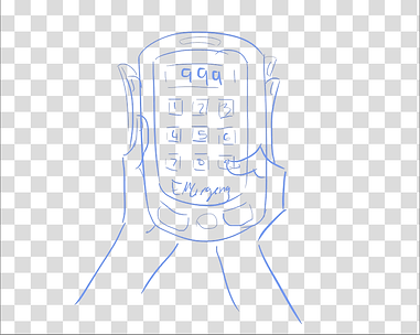
The images above are outlined versions of the sketches I've made. In the fourth frame I've made the outlines of the inner surface of the phone pink instead of black to make it more realistic (as I myself have the icons a different colour). The reason for the finger and inner surface intertwining on the fourth frame is to make it easier later to draw the finger move and dial the number (both were drawn on separate layers and later both have to change with each frame. Similarly on the third picture I didn't draw the pupils/eyelids of the character since I knew they'll be later moving from frame to frame.
After outlining the basic characters and backgrounds I have added a new layer and deleted the sketch layer so that it would not get in the way later on. On the new layer I've coloured the backgrounds with a basic marker tool to give them a cartoon-y and slightly messy feeling (just like a child's drawing) so that it'd be more appealing.Hardest task proved to be able to keep up with which scene is happening in which room and what colours had to be used there.
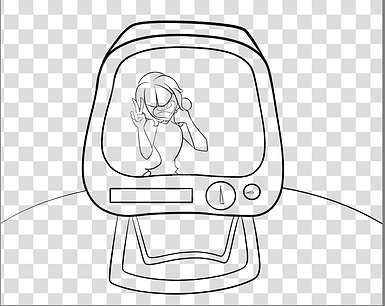
These are the final results of the base key frames in my final animation. As you can see in the final animation not only was the second frame re-used however the inside was different but also some minor details such as key notes were added to most of the frames. These were details that I could not include in the key frames as they often appeared after the viewer saw the original frame and were animated. In the final animation you might also notice that there is an improvised scene of the oven closing in on the curtain. This was added much later after I've created the animation as I've felt like it was missing the point of "how it came to this" situation.


Layers
As seen on the picture to the left, on the right side you can see how many layers I have used to make the single frame and all of it's movements. Because of Krita I was able to draw over each layer just like I would in Flash, however the simplicity was in the fact the Krita allowed me to make the layer below or above have lower opacity, making it much easier to draw over it and make slight changes.
This specific frame has been mostly changed by adding a speech bubble and notes which float towards the character; which was made easy when I made the notes on a different layer and could freely move them around.However most times I had to add layers each time I made a slight change such as adding more and more smoke into the room in one of the scenes.
On the right you can see all of the separate frames it took me to create the final scene alone. Each scene I have created a separate folder for on my computer and saved in order so that they would be easy to put together when I put them into flash.
The first file which does not have a number is the Krita file and the final file was me playing around in gif maker first to see if the animation would work and if yes what order everything would have to be in and whether or not the animation was smooth/lacking. After making the simple gif I have added the oven closing scene so I could say it proved to be very helpful.
After this I put all of the frames into flash to create the final animation below.
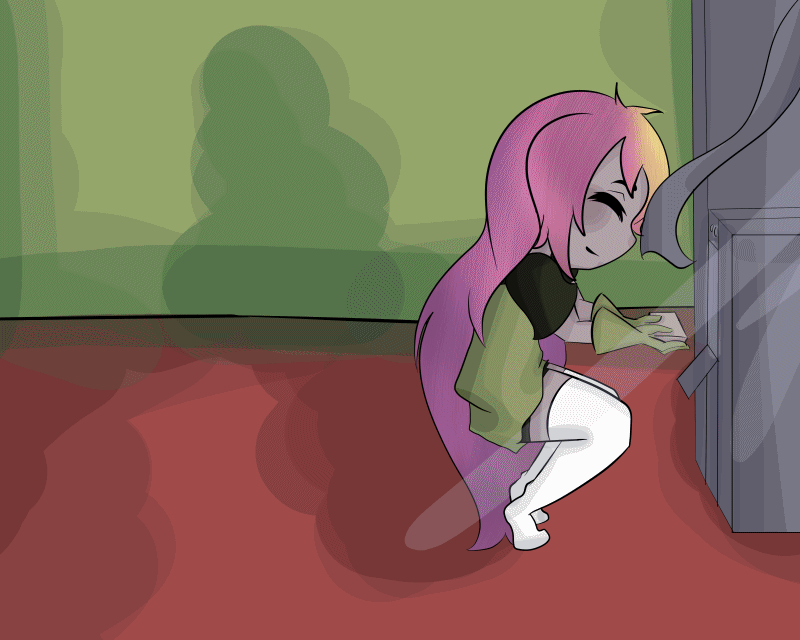
This is my final animation. As you can see the simple story revolves around a girl who got easily distracted while baking. The music coming from the TV proved as enough of a interruption in her routine that she simple shut the oven close without noticing she also stuck the curtain inside it too. The flames, or rather smoke quickly spread from the kitchen to the living room where the girl was watching TV and soon caught her attention. Thankfully she was able to call 999 in time for nothing serious to take place, however the irony is found in the TV message which practically shows how she was distracted with an announcement of what just happened to her.
This was my second idea for the story, the first being much more gruesome, showing the girl burn and then whisper the TV announcement, this idea was however scratched in favour of this one since it wasn't kids friendly enough and would defiantly not appeal to the target audience even though it did use a fear tactic that I have previously covered.
Evaluation
In this unit we had to make a fire safety animation. I feel like I have not achieved the best quality with this unit however tried very hard nonetheless. During this project the one thing I enjoyed the most was drawing the key frames for the animation. I've always loved drawing and the fact I was able to do so in this project is what made it very enjoyable to me. I have also enjoyed working with a new to me program, Flash, and all its features, yet was happy to hear I was allowed to draw the key frames in the program I usually use for drawing and that I find more comfortable; Krita. What I researched were different emotions that safety videos usually tried to awaken within the viewer/character design by modern popular artists who successfully released their own shows and new techniques which I have not heard of before such as rotoscoping. The technique I would like to work more on is rotoscoping and the one I feel quite confident in is creating the base key frames for my animation. The one problem I have encountered with the project was working with Flash when drawing in it since it was quite hard to add details to the drawings since some of the features did not work as expected (such as the eraser erasing each layer instead of only the one you were drawing on/selected).
If I was able to do this project again I would definitely improve on the final animation, which as I now observed, is too fast paced for anyone to understand when they watch it for the first time.