
Unit 4: Introduction to materials, processes and technical skills in art and design

NYC Roofs
Research images from Google Maps


Research images from Video Games
Research images from Photographs


First time using Maya
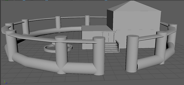
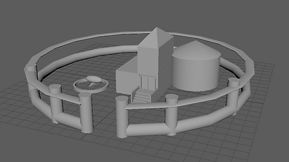
The first task that we were given when using Maya was to make a basic house. I was a great exercise since the base of the house was made by using the polygon cube tool which as I found out later is very often used in Maya. I then created another yet slimmer cute and put it on top of the first to create a second floor for the building. Wanting to test out most of the tools I have also used the polygon pyramid to make a simple roof for the second floor.
To create the fence I used two torus' and a cylinder which I later multiplied. The multiplied version set a patter which I could later use (it used the shift+D keys) to multiply it hand have the cylinders already be set around the circle at same angles.
For the doors I used simple polygonal cubes and for stairs I used cubes and similarly to how I created the fence, I used the commands for them to go up and multiply at the same time.


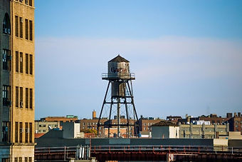
Research images of water towels in New York


I later changed the design of the house. I made the first floor much wider and got rid of the cylinder-like barn that was at the back of the main house, in my opinion it made the house look much too small especially since the doors were half of the first floor. This change made the house look much more realistic.
I made a similar change with the second floor and it's roof, I used the 'scale tool' to make them wider and look much more natural.
I imagine the house holding a single bedroom and being used by maximum of three people.
If I was able to create this house again I would definitely try to make the fence out of smaller cylinders and also would add windows out of cubes.


At first I decided to create the water tower which is commonly used on top of american rooftops. While doing research on them I have noticed that they are usually about one and a half or two stories tall which as I later found out while creating the buildings has helped me scale them.
At first I created a cylinder and flattened it to make the base. I then created another and put it on top to create the water holder. A cone was placed on top to create the roof which prevents the rain water from entering the tower.
I used the combine tool to stick the three elements together and make them one to later make it easier to raise them up and create another cylinder underneath which connects by four smaller cylinders which I had to thin by using the scale tool and multiply by clicking shift+D. I used the same method for the legs which the tower will stand on.
Space Ship


Texturing


Final Renders


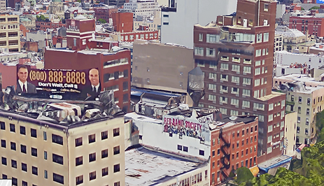
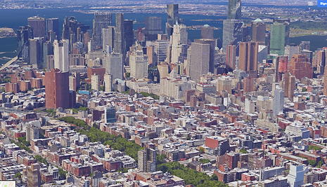
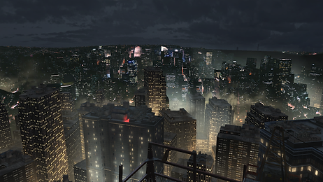
During my research I have went on to google maps and have searched for New York to get a better idea of how the city looks like in real like, without any modifications that maybe be used while taking pictured by photographers or modelers when creating games. I took 6 different screenshots to take inspiration from, 4/6 being taken from a person's perspective rather than Gods to see how it all should look when finished. The ones taken from above perspective let me see the height different between buildings and how the rooftops usually look.
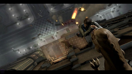
These are 5 screenshots I have found that capture New York in different games such as Bioshok Infinite or Assassins Creed. Each one game me a good idea of how the city is portrayed in games, for example how busy it always seems and always has a high contrast between the darkness and lights in the buildings or outside them, this actually quite reminded me of Caravaggio's art pieces. The screenshots also showed me how the camera is usually set behind the character or right above them to give a good view of the whole scenery.
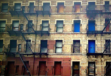
Those are six photographs that I have found of New York city. Each one of them concentrates on how the buildings look and I found it very interesting that in each shot the buildings seem to be build differently, showing the verity of them that appear in the city. This gave me inspiration to make my buildings as varied from each other as possible when it came to their structure and the sort of material they were build out of, and also made me realize how often buildings that vary greatly in height are still positioned very closely to one another creating great contrast.
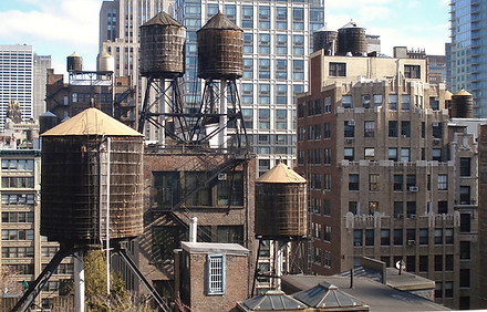
I have also found five different photographs of different styles of water towers. I researched them in particular because they are commonly found on the rooftops of New York city buildings, due to them being too tall for the water current to push that far upstream and deliver the water to the apartments. For my final tower I used the first short as seen because it looked most interesting and stable out of the ones I have seen.
Modelling Techniques
There exist three main modelling techniques that are used in the gaming and film industry to create realistic models of things or people.
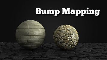
The first out of the three techniques is called "Bump Mapping", this is a technique used to simulate bumps and wrinkles on a flat or smooth surface. This technique was introduced in 1978 by James Blinn and is still used today on objects such as spheres to make them look more like realistic objects, an example of that would be a golf ball which is not smooth, but has small bumps all around it or a ball of clay which still hasn't been perfectly shaped. The one major problem with Bump Mapping is that it does not change the shape of the underlying object and so no matter what the object's outlines will always be a perfect sphere or whatever else the artist chose to use.
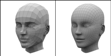
The second technique is simple called "Nurbs" and is commonly used by computer artists for precise modeling of curves and surfaces. Nurbs is a technique quite similar to the one I have previously used for modelling the spaceship, however it is much more flexible with the things it creates, often looking like a clean white sheet which was simply put over the object to cover it up. It allows people and computers to model very complex shapes such as cars, ships or even animals and humans! Needless to say it is very flexible with what it can create.

The third technique is named "Polygon Modelling". It is used in 3D modelling to create objects or people using polygons to represent the base surface. The main advantage of using this technique is that it is a much faster way to create objects, however there are many disadvantages to this method such as the fact it is unable to accurately represent curved surfaces and quite a large number of polygons must be used to present them in an appealing manner however a lot of computers are unable to hold that, also often times modelers have to use many models to create a single object since the pc or mac is unable to hold up that many polygons.
Architectural Visualization
Architectural Visualization is supposed to present a 2D structure of a building to a viewer and bring it to life.
The most common way an artists presents their work in Architectural Visualization is through presenting a building from a person's eye view, with only the exterior showing. The imagine can be of a single or multiple buildings and often shows off the appeal of only the outside of the building.


As seen on the two pictures the artists often use the contrasts between darkness and light in their image to show off more the appeal of the buildings and give them more personalty.

Another style that I have seen is where the creator highlights only the area that they have worked on, such as a park or a small gathering of buildings. The rest of the buildings and area are because of this usually in very grey or dark tones, as if the artists was trying to take the attention away from them and make them seem not important, whereas his main attraction make as bright and eye catching as possible.
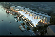
The unfinished buildings in the distance always seem very unfinished and as if the viewer was seeing them through a fog, even more not to catch a glimpse of them.
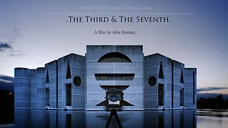
A great example of Architectural Visualization is the 7 year old short 14 minute movie created by Alex Roman, which was titles 'the Third and the Seventh'. The entirety of the movie was created using 3Dmax, Vary and After Effects, all by this one man. The end product not only looks absolutely stunning to the eyes, each shot zooming in and out of focus to bring into attention even the tiniest of details, it is almost unbelievable to think that someone has created this in a 3D program rather than actually filmed or photographed something real. What he has created with his shots is what I will try my best to achieve in my final renders.
Simple Techniques
I decided to test out simple modeling techniques to create my water tower, since it seemed like quite a hard structure to recreate using Maya and had many small refined elements that I had to copy, it was a great practice for later.
I then added two rings around the tower and used simple tubes to support them up to make the entire build more stable if it were to come to life, I used the same options over and over to recreate a ladder and additional five legs than supported the main water holding cylinder. To add details which are often seen on water towers across New York city I have cleared smaller rings to go around the outside layer of the main cylinder and small tubed to make a checkered pattern a added another ladder leading to the very top.
This is what the final plain model of the water tower looks like. I have decided to take this short from an 'under' view to make sure it was as it a real person was looking at it. I am overall very pleased with how this construction turned out and how real it looks and keeps up to what I took inspiration from.
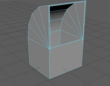
Another very important technique that I have learned was when creating this very simple bin or ventilation unit that I can easily later place outside or on any house or building in my final product. The technique used for this was to take a simple square that I have created, select its face that was facing upwards and a bend that was connecting it to the one facing the camera by using the 'face' then 'multi' tools.
I then edited the mesh and bent it at a 90 degree angle, then selected the face again and used 'ctrl-e' commend to make the surface box smaller. Then used the same commend to extrude it back down.
Modeling New York
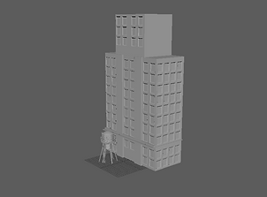
At first for my prime building I make a very simple structure, using the water tower to decide hot big everything will have to be in comparison. The windows were relatively easy to create using the 'ctrl+e' command to make a dent in the face then copy and paste them.
I then made sure the windows weren't inverted and added an additional later on top of them which I later used to put the glass texture on. I also deleted two windows at the bottom to make space for the double doors that I plan to put in and added windows on the sides.
I added an additional box on top to make the entire building much more realistic and deleted every third window to make space for two thin layers that went out of the building, making it look much more sophisticated and realistic. After the first two floors I added another layers this time horizontally again to achieve a similar effect visually as before.
To add another level of detail I added a sign on top of the building which I will later make into a poster when texturing.
To finish the simple building off I added small ventilation units to some windows and to every second window in the middle a small space with a fence where real people could easily put flowers of other small yet pleasant to the eyes objects.
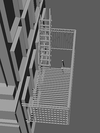
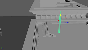
On the side of the building I decided to create a stair case in case of a fire, which are often seen in New York. I used a basic ladder-like stairs that I created for the people to walk on and the rest made out of simple cylinders that I copied until I got the final appropriate look.
I used the copy and paste tool to duplicate the stair cases, each time having to adjust small detail such as the side the gap would be at for the stairs to come in and out of the surface.
This is what the stair case looks like from close up, depending on where is it small details such as the length of the ladder can be different or where the hold for the stair to come is positioned.
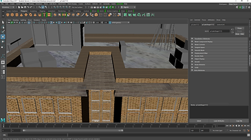
These two screen shots show how the building looks un-textured in it's final form along with the final build of the stairs which go all the way up the building to make it easy for the player to backtrack or progress with the roof top runner.
To make the ventilation system on top of the fist building I have used completely new to me techniques which required me to put a shape through the square that I have created.
Then use a command that allowed me to cut the shame (circle) through the square leaving me with a vent-like hole.
I also had to select the two lines coming from the cut out circle and delete them, if I didn't do this the object I wish to treat as one would be actually treated as two separate where the lines are.
In the end I also added two polygon torus's around the cut out circles to add a smoother look to the overall structure of the vent, while creating a bit more complicated ladder on the side of the building.
I tried creating a fence around the first building, however at my first try I wanted to use the polygon plane tool to make the spike at the end, this proved to be a much harder and complicated way to do something that is actually quite simple.
The much simpler way of doing this was to simply select the face that was pointing upwards and then use 'ctrl+e', making the extendable surface smaller then simple and easily pulling it up to create the spike as seen above.
I duplicated the spikes to make a fence then added three simple stretched out cubes to connect them and make it more realistic.
As seen in the final product the fence goes around the building creating a small garden for the people that could possibly live there, although it is in the middle of the city it is no uncommon for small parks like this to exist that are exclusive for those who live in one of the apartments.
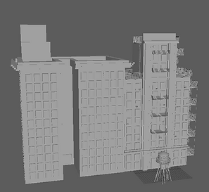
To create the final third building I used three different cubes to shape it. Then used the same method to place the windows and door. I used simple cubes that have been stretched out to create the roof outlines and duplicated them each time making them slightly bigger.
I added more windows on the sides and the top two cubes in hopes of achieving a similar effect I did with the last building.
I added windows and a door to the top cubes, making it look like inside stairs were simply leading to the top of the roof. also added simple boxes that would be on top of the roof.
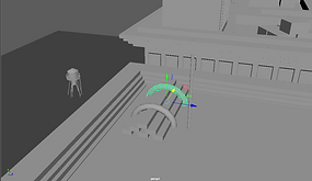
On the roof of the second building I added the water tower, however made it slightly smaller since it seemed out of place when it was bigger and added an electricity box where all the wires for the building would be stored away. I also took away the top of the small cube to make it a singular floor instead.
To create the third building I actually used many separate parts to create it unlike I did for the other two where I started off with a simple cube. I wanted the make the interior empty on the first floor and make it look like a parking so I had to use four different cubes to make the walls for the first floor then a cube for the top four.
Like I did for building 1, I added stretchered out layers to give the building more stylistic look around the edges and each floor. And similarly to the second building, I made the roof push outwards.
I used the same technique tat I did at first for the bins and ventilation systems to push inside the inside of the parking ticket machine.
I took inspiration from real ticket machines at parking lots to create this one. I has two separate parts, the first being the ticket machine itself.
The second part is the one which stops the cars from coming inside. As seen inside the building I created stairs leading up and the walls are supposed to separate the parking spaces for the people.
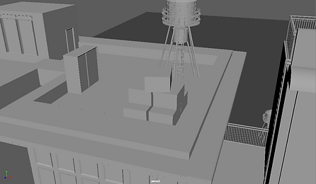
I believe I have made the roof of the third building so far the most complicated and detailed one, with most stuff on it that would be found commonly (in my opinion) on roof tops. The first thing that I created was another billboard which are often seen in capital cities such as New York or London on top of the buildings of on their sides.
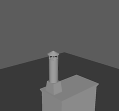
I then created a chimney which by far has proven to be the most difficult part of the build because of how many parts it had and how different they all were to each other. I had to hollow out a cylinder for the air to pass easily through the tubes and then create a flat circle which's surface I had to pull out to make the top for the metal part of the chimney.
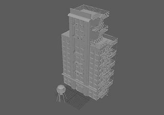
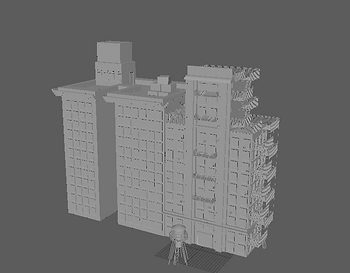
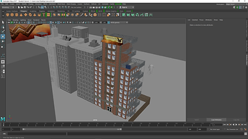
These are my 8 final renders of my small town. For the background I used a hollowed out and inverted cylinder which I added texture on top of and added many boxes which I put simple textures on that are seamless.
On top of the building I have also placed logs of wood (which will be much more obvious to the eye once the textures are on) which are held down by rope and covered by a model made of wood and metal, sheltering it from things such as heavy rain or sunrise.
This is how the final outcome came out looking without the texture on, I later used the same model of 'shelter' on the same building to make it easier to move from it to the top building and vice versa.
For the fourth main building I have used a simple box then used it as life surface to make a huge poster which I later on textured.
I added simple windows and doors on the building everywhere except for the place where the poster was supposed to be placed.
I then added more boxed on it using the life surface tool and make the building look more abstract.
In the mean time I have learned how to texture and have used this skill to texture small objects first around the map such as boxes, metal pipes and such which could be found on the roofs of most buildings.
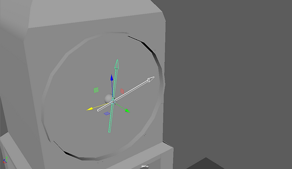
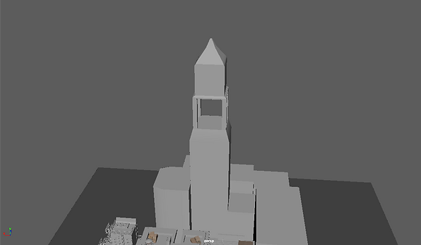
As one of my buildings I added a overshadowing clock tower, which I knew was inspired by that which you often see in London however I thought was a really pleasant touch to the otherwise modern buildings.
Creating the clock part of it was one of the more challenging things I have found during this unit as it forced me to select many minor polygons in order to pull them out and change the way they are shaped.
The arrows for the clock were pretty easy to make as it only required my to use the ctrl + e command to expand on one side of the expanded cube then do the same however make it much smaller, similar to how I created the fence.
Wanting to make the clock tower look even more old I have added two bells that would ring each tie a different hour strikes. I created them by mostly using the ctrl + e command and then hollowing out the inside using the same command.
Wanting the third building's roof to be more varied from the others I have added a set of tables and chairs to make it look like a balcony. I also added a device often used by window cleaners of people who paint/glue posters onto tall buildings.
Evaluation
The project we have been working on was not only inspiring to me however also gave me a good idea of what the rest of the course and industry had in store for me. I believe the final product and my renders that I have created are the best that I could accomplish at the moment however I am aware that there is always room for more improvement and that I could have made sure to ask more for help to improve whatever problems I have faced. The techniques that I have learnt about and used on every day basis using the program (Maya) are not only very intriguing but also helpful if I were ever to use the program again, tools such as the extruding tool and even something as simple as the ctrl + e command allowed me to create my entire unit and final product. The techniques and tools that I would like to develop a further understanding of are the animation tool and to learn more about Arnold and its rendering features which at times still leave me baffled.
During the project we have researched many games and real life objects which helped us create a realistic image of New York city, however often with an unusual twist just like with any game, a realistic way to looking at what was actually created by the computer.
I feel like the most successful part of my project was modelling the buildings, where I had free will (to an extend) to create pretty much anything I wished as long as it was relevant to the topic.
What I feel like I could have worked on more however was definitely the texturing and my poor time management which left me with much work left to do in little time.
If I did this project again I would definitely put more effort into planning out the set out of each building and plan out my tie more efficiently.
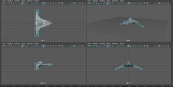
These images are of when we used Maya for the second time and created a space ship using and learning tools such as the edge loop tool and the extruding technique.
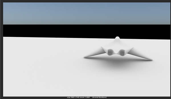
These are the two final renders which I have created of the space ship. The first one is fuzzy due to its poor quality however before making the second I have made adjustments to the tools we used and it came it much smoother.